Cover Flow
Music library with the classic 3D cover flow, mirrored reflections and momentum flicks.
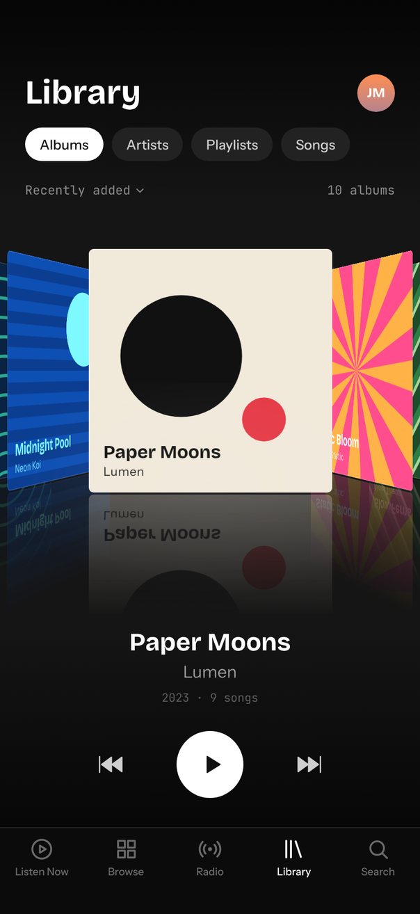
Live demo. Drag it, tap it.
How it works
itemSizeis 90 per 200 pt of cover, anditemAnimationputs ±1 at 120 from the center and every album beyond only 48 further, so the sides stack up.- Inside each item,
relativeProgressturns the cover up to 62° on Y and scales it to 0.88, with a flipped copy underneath as the reflection. snapMode="nearest"withsnapMomentum0.4 lets a flick skip several albums;progressswaps the caption, and the arrows callref.prev()andref.next().
Uses
Full source
import { SceneScreen, useScene } from "@/features/scenes/kit";
import { LinearGradient } from "expo-linear-gradient";
import * as React from "react";
import { Pressable, StyleSheet, Text, View } from "react-native";
import Animated, {
	Easing,
	type SharedValue,
	useAnimatedReaction,
	useAnimatedStyle,
	useSharedValue,
	withTiming,
} from "react-native-reanimated";
import {
	Carousel,
	type CarouselItemAnimation,
	type CarouselRef,
} from "react-native-reanimated-carousel";
import Svg, {
	Defs,
	Path,
	RadialGradient,
	Rect,
	Stop,
	LinearGradient as SvgGradient,
} from "react-native-svg";
import { scheduleOnRN } from "react-native-worklets";

type Art = keyof typeof ART;

interface Album {
	title: string;
	artist: string;
	year: number;
	songs: number;
	art: Art;
}

const ALBUMS: Album[] = [
	{
		title: "Midnight Pool",
		artist: "Neon Koi",
		year: 2024,
		songs: 11,
		art: "pool",
	},
	{ title: "Paper Moons", artist: "Lumen", year: 2023, songs: 9, art: "moons" },
	{
		title: "Static Bloom",
		artist: "Velvet Static",
		year: 2024,
		songs: 12,
		art: "bloom",
	},
	{
		title: "Slow Ferns",
		artist: "Moss Theory",
		year: 2022,
		songs: 8,
		art: "ferns",
	},
	{
		title: "Gold Hours",
		artist: "Sunday Club",
		year: 2025,
		songs: 10,
		art: "gold",
	},
	{
		title: "Glass Garden",
		artist: "Iris Park",
		year: 2023,
		songs: 13,
		art: "glass",
	},
	{
		title: "Northbound",
		artist: "The Long Coats",
		year: 2021,
		songs: 10,
		art: "north",
	},
	{
		title: "Heat Index",
		artist: "Coral Drive",
		year: 2025,
		songs: 9,
		art: "heat",
	},
	{
		title: "Afterglow",
		artist: "Mira Sol",
		year: 2024,
		songs: 11,
		art: "glow",
	},
	{
		title: "Low Tide",
		artist: "Harbor Lights",
		year: 2022,
		songs: 12,
		art: "tide",
	},
];

const BG = "#151515";
const EASE_OUT_QUART = Easing.bezier(0.25, 1, 0.5, 1);

// Cover art lives in a 200 x 200 box: a background plus a few flat, even-odd filled paths.
const each = (n: number, part: (k: number) => string) =>
	Array.from({ length: n }, (_, k) => part(k)).join("");
const circle = (x: number, y: number, r: number) =>
	`M${x - r} ${y}a${r} ${r} 0 1 0 ${2 * r} 0a${r} ${r} 0 1 0 ${-2 * r} 0`;
const bands = (n: number, from: number, step: number, h: number) =>
	each(n, (k) => `M0 ${from + step * k}h200v${h}H0z`);
const stripes = (offset: number, w: number) =>
	each(12, (k) => {
		const a = (26 * k + offset) * Math.SQRT2;
		const b = a + w * Math.SQRT2;
		return `M${a + 300} -300L${b + 300} -300L${b - 300} 300L${a - 300} 300Z`;
	});
const ray = (deg: number) => {
	const a = (deg * Math.PI) / 180;
	return `${100 + 150 * Math.sin(a)} ${100 - 150 * Math.cos(a)}`;
};
const FULL = "M0 0h200v200H0z";
const RAYS = each(
	12,
	(k) => `M100 100L${ray(10 + 30 * k)}L${ray(25 + 30 * k)}Z`,
);
const DOTS = each(169, (k) =>
	circle(8 + 16 * (k % 13), 8 + 16 * Math.floor(k / 13), 2.5),
);
const CHECKS = each(16, (k) => {
	const x = 50 * (k % 4);
	const y = 50 * Math.floor(k / 4);
	return `M${x + 25} ${y}h25v25h-25zM${x} ${y + 25}h25v25h-25z`;
});
// Each ring is the band between two circles.
const RINGS = each(
	15,
	(k) => circle(100, 240, 8 + 18 * k) + circle(100, 240, 11 + 18 * k),
);

const ART = {
	pool: {
		ink: "#7DF9FF",
		bg: ["#0E4FB3", "#0E4FB3"],
		layers: [
			[bands(10, 10, 20, 10), "#0B3D91"],
			[circle(140, 60, 36), "#7DF9FF"],
		],
	},
	moons: {
		ink: "#111111",
		bg: ["#F1E9DA", "#F1E9DA"],
		layers: [
			[circle(76, 88, 50), "#111111"],
			[circle(144, 140, 18), "#E63946"],
		],
	},
	bloom: {
		ink: "#FFFFFF",
		bg: ["#FFB347", "#FFB347"],
		layers: [[RAYS, "#FF4D8D"]],
	},
	ferns: {
		ink: "#EFFFE6",
		bg: ["#1F4D2B", "#1F4D2B"],
		layers: [
			[stripes(14, 8), "#2E7D46"],
			[stripes(22, 4), "#A7D49B"],
		],
	},
	gold: {
		ink: "#4A1C00",
		bg: ["#FF6B3D", "#FF6B3D"],
		layers: [
			[bands(4, 18, 54, 18), "#FF8E53"],
			[bands(4, 36, 54, 18), "#FFB36B"],
			[circle(100, 200, 76), "#FFE08A"],
		],
	},
	glass: {
		ink: "#FFFFFF",
		bg: ["#B9A7FF", "#7C6CF2"],
		layers: [[DOTS, "rgba(255,255,255,0.4)"]],
	},
	north: {
		ink: "#2D3A4E",
		bg: ["#5B6B82", "#2D3A4E"],
		layers: [["M200 0V200H0Z", "#E8EEF5"]],
	},
	heat: {
		ink: "#1B1B1B",
		bg: ["#F3EDE2", "#F3EDE2"],
		layers: [[CHECKS, "#E4572E"]],
	},
	glow: {
		ink: "#FFFFFF",
		bg: ["#E5989B", "#E5989B"],
		layers: [
			[FULL, "url(#glow-c)"],
			[FULL, "url(#glow-b)"],
			[FULL, "url(#glow-a)"],
		],
	},
	tide: {
		ink: "#E0FFF7",
		bg: ["#0A2342", "#0A2342"],
		layers: [[RINGS, "#2CA58D"]],
	},
} satisfies Record<string, { ink: string; bg: string[]; layers: string[][] }>;

// Afterglow's three soft blobs.
const GLOWS = [
	{ id: "glow-a", cx: 40, cy: 40, r: 124, color: "#FFB4A2" },
	{ id: "glow-b", cx: 160, cy: 60, r: 106, color: "#B5838D" },
	{ id: "glow-c", cx: 100, cy: 180, r: 124, color: "#6D597A" },
];

const AlbumArt = React.memo(function AlbumArt({
	album,
	size,
}: {
	album: Album;
	size: number;
}) {
	const k = size / 200;
	const { ink, bg, layers } = ART[album.art];
	return (
		<View
			style={[styles.art, { width: size, height: size, borderRadius: 4 * k }]}
		>
			<Svg width={size} height={size} viewBox="0 0 200 200">
				<Defs>
					<SvgGradient id={`${album.art}-bg`} x1="0.33" y1="0" x2="0.67" y2="1">
						<Stop offset="0" stopColor={bg[0]} />
						<Stop offset="1" stopColor={bg[1]} />
					</SvgGradient>
					{album.art === "glow" &&
						GLOWS.map((g) => (
							<RadialGradient
								key={g.id}
								id={g.id}
								cx={g.cx}
								cy={g.cy}
								r={g.r}
								gradientUnits="userSpaceOnUse"
							>
								<Stop offset="0" stopColor={g.color} />
								<Stop offset="1" stopColor={g.color} stopOpacity={0} />
							</RadialGradient>
						))}
				</Defs>
				<Path d={FULL} fill={`url(#${album.art}-bg)`} />
				{layers.map(([d, fill]) => (
					<Path key={fill} d={d} fill={fill} fillRule="evenodd" />
				))}
			</Svg>
			<View
				style={[
					styles.artLabel,
					{ left: 12 * k, right: 12 * k, bottom: 10 * k },
				]}
			>
				<Text
					numberOfLines={1}
					style={[
						styles.artTitle,
						{ color: ink, fontSize: 15 * k, lineHeight: 18 * k },
					]}
				>
					{album.title}
				</Text>
				<Text
					numberOfLines={1}
					style={[
						styles.artArtist,
						{ color: ink, fontSize: 10 * k, lineHeight: 13 * k },
					]}
				>
					{album.artist}
				</Text>
			</View>
			<View style={[styles.artEdge, { borderRadius: 4 * k }]} />
		</View>
	);
});

interface CoverProps {
	album: Album;
	size: number;
	top: number;
	itemSize: number;
	relativeProgress: SharedValue<number>;
}

// The tilt lives inside the item, so every cover turns around its own center.
const Cover = React.memo(function Cover({
	album,
	size,
	top,
	itemSize,
	relativeProgress,
}: CoverProps) {
	const tilt = useAnimatedStyle(() => {
		const a = Math.max(-1, Math.min(1, relativeProgress.value));
		return {
			transform: [
				{ perspective: 3.5 * size },
				{ rotateY: `${-a * 62}deg` },
				{ scale: 1 - 0.12 * Math.abs(a) },
			],
		};
	});
	return (
		<View style={styles.fill}>
			<Animated.View
				style={[
					styles.cover,
					{ left: (itemSize - size) / 2, top, width: size, height: size },
					tilt,
				]}
			>
				<AlbumArt album={album} size={size} />
				{/* Reflection: the same cover flipped, fading into the floor color. */}
				<View
					style={[styles.reflection, { top: size + 2, height: size * 0.5 }]}
				>
					<View style={styles.mirror}>
						<AlbumArt album={album} size={size} />
					</View>
					<LinearGradient
						colors={[`${BG}00`, BG]}
						style={StyleSheet.absoluteFill}
					/>
				</View>
			</Animated.View>
		</View>
	);
});

// Mounted again (new key) for every album, so the caption fades up into place.
function SwapText({ style, children }: { style: object; children: string }) {
	const t = useSharedValue(0);
	React.useEffect(() => {
		t.value = withTiming(1, {
			duration: 350,
			easing: Easing.out(Easing.cubic),
		});
	}, []);
	const anim = useAnimatedStyle(() => ({
		opacity: t.value,
		transform: [{ translateY: (1 - t.value) * 6 }],
	}));
	return (
		<Animated.Text numberOfLines={1} style={[style, anim]}>
			{children}
		</Animated.Text>
	);
}

const ICONS = {
	next: "M3.5 6.5v11l7.5-5.5zM11.5 6.5v11l7.5-5.5zM20.5 6v12",
	prev: "M20.5 6.5v11L13 12zM12.5 6.5v11L5 12zM3.5 6v12",
	play: "M8 5.5v13l10.5-6.5z",
	pause: "M7 5.5h3.2v13H7zM13.8 5.5H17v13h-3.2z",
	chevron: "M7 10l5 5 5-5",
	listen: "M12 3a9 9 0 1 0 0 18a9 9 0 1 0 0-18M10.2 8.6v6.8l5.6-3.4z",
	browse:
		"M4 4h6.5v6.5H4zM13.5 4H20v6.5h-6.5zM4 13.5h6.5V20H4zM13.5 13.5H20V20h-6.5z",
	radio:
		"M7.8 7.8a6 6 0 0 0 0 8.4M16.2 7.8a6 6 0 0 1 0 8.4M5 5a10 10 0 0 0 0 14M19 5a10 10 0 0 1 0 14M12 11a1 1 0 1 0 0 2a1 1 0 1 0 0-2",
	library: "M5 4v16M9.5 4v16M14 4.6l5 14.8",
	search: "M11 4.5a6.5 6.5 0 1 0 0 13a6.5 6.5 0 1 0 0-13M16 16l4.5 4.5",
};

function Icon({
	d,
	size = 24,
	color,
	solid,
}: {
	d: string;
	size?: number;
	color: string;
	solid?: boolean;
}) {
	return (
		<Svg width={size} height={size} viewBox="0 0 24 24">
			<Path
				d={d}
				fill={solid ? color : "none"}
				stroke={color}
				strokeWidth={solid ? 1 : 1.8}
				strokeLinecap="round"
				strokeLinejoin="round"
			/>
		</Svg>
	);
}

const SECTIONS = ["Albums", "Artists", "Playlists", "Songs"];
const TABS = [
	{ label: "Listen Now", icon: ICONS.listen },
	{ label: "Browse", icon: ICONS.browse },
	{ label: "Radio", icon: ICONS.radio },
	{ label: "Library", icon: ICONS.library },
	{ label: "Search", icon: ICONS.search },
];

function TabBar({ bottom }: { bottom: number }) {
	return (
		<View style={[styles.tabBar, { paddingBottom: Math.max(bottom, 8) }]}>
			{TABS.map((tab) => {
				const color = tab.label === "Library" ? "#FFFFFF" : "#6B6B6B";
				return (
					<View key={tab.label} style={styles.tab}>
						<Icon d={tab.icon} color={color} />
						<Text style={[styles.tabLabel, { color }]}>{tab.label}</Text>
					</View>
				);
			})}
		</View>
	);
}

function CoverFlow() {
	const { width, height, insets } = useScene();
	const ref = React.useRef<CarouselRef>(null);
	const progress = useSharedValue(0);
	const [index, setIndex] = React.useState(0);
	const [playing, setPlaying] = React.useState(false);

	// The header, caption, controls and tab bar take about 370 pt; the covers get the rest.
	const free = height - insets.top - Math.max(insets.bottom, 8) - 370;
	const cover = Math.round(Math.min(width * 0.58, free / 1.62));
	const k = cover / 200; // the prototype's numbers are for a 200 pt cover
	const itemSize = 90 * k;
	const coverTop = Math.round(cover * 0.12);

	const itemAnimation = React.useCallback<CarouselItemAnimation>(
		(value) => {
			"worklet";
			const d = Math.abs(value);
			// ±1 sits 120 from the center; each album further out adds only 48, so the sides stack.
			const x = d <= 1 ? value * 120 : Math.sign(value) * (120 + (d - 1) * 48);
			return {
				transform: [{ translateX: x * k + (width - itemSize) / 2 }],
				zIndex: Math.round(100 - d * 10),
				opacity: d > 5 ? 0 : 1,
			};
		},
		[k, width, itemSize],
	);

	// Swap the caption as soon as another album crosses the center, not only when it settles.
	useAnimatedReaction(
		() => {
			const n = ALBUMS.length;
			return ((Math.round(progress.value) % n) + n) % n;
		},
		(current, previous) => {
			if (current !== previous) scheduleOnRN(setIndex, current);
		},
	);

	const renderItem = React.useCallback(
		({
			item,
			relativeProgress,
		}: {
			item: Album;
			relativeProgress: SharedValue<number>;
		}) => (
			<Cover
				album={item}
				size={cover}
				top={coverTop}
				itemSize={itemSize}
				relativeProgress={relativeProgress}
			/>
		),
		[cover, coverTop, itemSize],
	);

	const album = ALBUMS[index];

	return (
		<View style={styles.fill}>
			<LinearGradient
				colors={["#050505", BG]}
				style={{ paddingTop: insets.top + 8, paddingBottom: 8 }}
			>
				<View style={styles.row}>
					<Text style={styles.heading}>Library</Text>
					<LinearGradient colors={["#FF8E53", "#B5838D"]} style={styles.avatar}>
						<Text style={styles.avatarText}>JM</Text>
					</LinearGradient>
				</View>
				<View style={styles.chips}>
					{SECTIONS.map((label) => (
						<View
							key={label}
							style={[styles.chip, label === "Albums" && styles.chipOn]}
						>
							<Text
								style={[
									styles.chipText,
									label === "Albums" && styles.chipTextOn,
								]}
							>
								{label}
							</Text>
						</View>
					))}
				</View>
				<View style={[styles.row, { marginTop: 20 }]}>
					<View style={styles.sort}>
						<Text style={styles.mono}>Recently added</Text>
						<Icon d={ICONS.chevron} size={14} color="#8A8A8A" />
					</View>
					<Text style={styles.mono}>{ALBUMS.length} albums</Text>
				</View>
			</LinearGradient>

			<View style={styles.stage}>
				<Carousel
					ref={ref}
					data={ALBUMS}
					loop
					autoplay
					autoplayInterval={1800}
					itemSize={itemSize}
					style={{ width, height: Math.round(cover * 1.62) }}
					snapMode="nearest"
					snapMomentum={0.4}
					animation={{ type: "timing", duration: 600, easing: EASE_OUT_QUART }}
					progress={progress}
					itemAnimation={itemAnimation}
					renderItem={renderItem}
				/>
				<Svg
					width={width}
					height={cover}
					style={[styles.glow, { top: coverTop + cover * 0.6 }]}
				>
					<Defs>
						<RadialGradient id="floor-glow" cx="50%" cy="40%" rx="50%" ry="50%">
							<Stop offset="0" stopColor="#FFFFFF" stopOpacity={0.07} />
							<Stop offset="1" stopColor="#FFFFFF" stopOpacity={0} />
						</RadialGradient>
					</Defs>
					<Rect width={width} height={cover} fill="url(#floor-glow)" />
				</Svg>
			</View>

			<LinearGradient colors={[BG, "#070707"]}>
				<View style={styles.caption}>
					<SwapText key={album.title} style={styles.title}>
						{album.title}
					</SwapText>
					<SwapText key={album.artist} style={styles.artist}>
						{album.artist}
					</SwapText>
					<Text
						style={styles.meta}
					>{`${album.year} · ${album.songs} songs`}</Text>
				</View>
				<View style={styles.controls}>
					<Pressable
						accessibilityLabel="Previous album"
						hitSlop={12}
						onPress={() => ref.current?.prev()}
					>
						<Icon d={ICONS.prev} size={30} color="#CFCFCF" solid />
					</Pressable>
					<Pressable
						accessibilityLabel={playing ? "Pause" : "Play"}
						onPress={() => setPlaying((on) => !on)}
						style={({ pressed }) => [
							styles.play,
							{
								paddingLeft: playing ? 0 : 3,
								transform: [{ scale: pressed ? 0.94 : 1 }],
							},
						]}
					>
						<Icon
							d={playing ? ICONS.pause : ICONS.play}
							size={28}
							color="#111111"
							solid
						/>
					</Pressable>
					<Pressable
						accessibilityLabel="Next album"
						hitSlop={12}
						onPress={() => ref.current?.next()}
					>
						<Icon d={ICONS.next} size={30} color="#CFCFCF" solid />
					</Pressable>
				</View>
			</LinearGradient>
			<TabBar bottom={insets.bottom} />
		</View>
	);
}

export default function Scene() {
	return (
		<SceneScreen
			background={BG}
			statusBar="light"
			fonts={[
				"Bricolage-Bold",
				"Instrument-Regular",
				"Instrument-Medium",
				"JetBrainsMono-Regular",
			]}
		>
			<CoverFlow />
		</SceneScreen>
	);
}

const styles = StyleSheet.create({
	fill: { flex: 1 },
	row: {
		flexDirection: "row",
		alignItems: "center",
		justifyContent: "space-between",
		paddingHorizontal: 24,
	},
	heading: {
		fontFamily: "Bricolage-Bold",
		fontSize: 32,
		lineHeight: 38,
		color: "#FFFFFF",
	},
	avatar: {
		width: 36,
		height: 36,
		borderRadius: 18,
		alignItems: "center",
		justifyContent: "center",
	},
	avatarText: { fontFamily: "Bricolage-Bold", fontSize: 13, color: "#FFFFFF" },
	chips: { flexDirection: "row", gap: 8, paddingHorizontal: 24, marginTop: 14 },
	chip: {
		height: 32,
		paddingHorizontal: 14,
		borderRadius: 16,
		justifyContent: "center",
		backgroundColor: "#222222",
	},
	chipOn: { backgroundColor: "#FFFFFF" },
	chipText: {
		fontFamily: "Instrument-Medium",
		fontSize: 13,
		lineHeight: 16,
		color: "#CFCFCF",
	},
	chipTextOn: { color: "#111111" },
	sort: { flexDirection: "row", alignItems: "center", gap: 2 },
	mono: {
		fontFamily: "JetBrainsMono-Regular",
		fontSize: 12,
		lineHeight: 16,
		color: "#8A8A8A",
	},
	stage: { flex: 1, justifyContent: "center" },
	glow: { position: "absolute", left: 0, pointerEvents: "none" },
	cover: { position: "absolute" },
	art: { overflow: "hidden" },
	artLabel: { position: "absolute" },
	artTitle: { fontFamily: "Bricolage-Bold" },
	artArtist: {
		fontFamily: "Instrument-Regular",
		letterSpacing: 0.4,
		opacity: 0.9,
	},
	artEdge: {
		...StyleSheet.absoluteFillObject,
		borderWidth: StyleSheet.hairlineWidth,
		borderColor: "rgba(255,255,255,0.12)",
	},
	reflection: {
		position: "absolute",
		left: 0,
		right: 0,
		overflow: "hidden",
		opacity: 0.9,
	},
	mirror: { opacity: 0.32, transform: [{ scaleY: -1 }] },
	caption: { alignItems: "center", paddingHorizontal: 24 },
	title: {
		fontFamily: "Bricolage-Bold",
		fontSize: 24,
		lineHeight: 30,
		color: "#FFFFFF",
	},
	artist: {
		fontFamily: "Instrument-Regular",
		fontSize: 16,
		lineHeight: 22,
		color: "#9A9A9A",
		marginTop: 2,
	},
	meta: {
		fontFamily: "JetBrainsMono-Regular",
		fontSize: 11,
		lineHeight: 16,
		color: "#5E5E5E",
		marginTop: 6,
	},
	controls: {
		flexDirection: "row",
		alignItems: "center",
		justifyContent: "center",
		gap: 48,
		paddingTop: 24,
		paddingBottom: 28,
	},
	play: {
		width: 64,
		height: 64,
		borderRadius: 32,
		backgroundColor: "#FFFFFF",
		alignItems: "center",
		justifyContent: "center",
	},
	tabBar: {
		flexDirection: "row",
		paddingTop: 8,
		backgroundColor: "#0B0B0B",
		borderTopWidth: StyleSheet.hairlineWidth,
		borderTopColor: "rgba(255,255,255,0.1)",
	},
	tab: { flex: 1, alignItems: "center", gap: 4 },
	tabLabel: { fontFamily: "Instrument-Medium", fontSize: 10, lineHeight: 12 },
});