Helix Gallery
A photo album wound around a vertical 3D helix that keeps turning on its own.
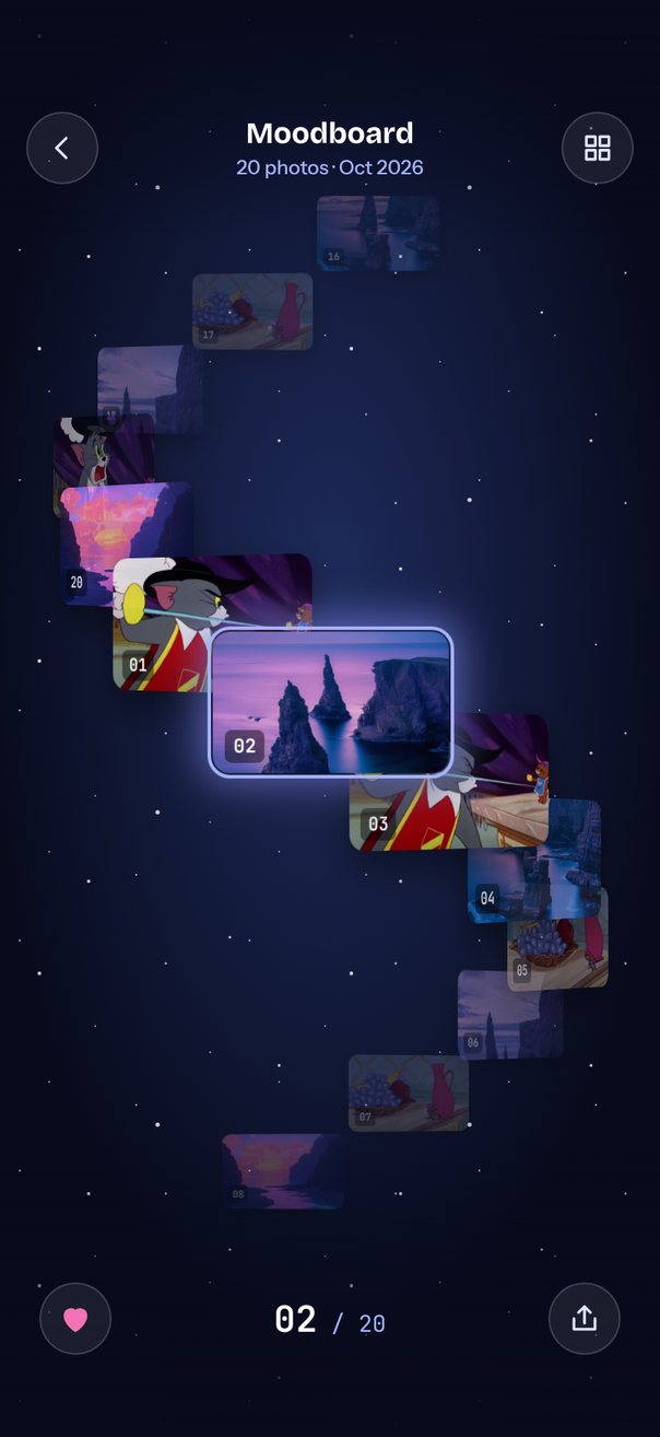
Live demo. Drag it, tap it.
How it works
- A vertical
loopcarousel of 20 photos uses anitemSizeof 1/13 of the space between the bars (47 pt on an iPhone 17 Pro) andautoplayevery 1500 ms. itemAnimationputs each photo at x = 0.35·width·sin(value·32°) and y = value·itemSize; cos(value·32°) is its depth, which sets opacity andzIndex.- Inside each tile
relativeProgressturns the photo withperspective800 androtateYup to 55°, scales it from 0.55 to 1.05 and lights the glow ring, whileprogressdrifts two star layers.
Uses
Full source
import { PURPLE_IMAGES } from "@/constants/purple-images";
import { getImages } from "@/features/custom-animations/quick-swipe/images";
import { SceneScreen, useScene } from "@/features/scenes/kit";
import { Image } from "expo-image";
import { LinearGradient } from "expo-linear-gradient";
import * as React from "react";
import { Pressable, StyleSheet, Text, View } from "react-native";
import Animated, {
	Easing,
	type SharedValue,
	interpolate,
	useAnimatedReaction,
	useAnimatedStyle,
	useSharedValue,
} from "react-native-reanimated";
import {
	Carousel,
	type CarouselAnimation,
	type CarouselItemAnimation,
	type CarouselRenderItem,
} from "react-native-reanimated-carousel";
import Svg, {
	Circle,
	Defs,
	Path,
	Pattern,
	RadialGradient,
	Rect,
	Stop,
} from "react-native-svg";
import { scheduleOnRN } from "react-native-worklets";

// 20 photos: seascapes on odd slots, film frames on even ones.
const FRAMES = getImages();
const PHOTOS = Array.from({ length: 20 }, (_, i) =>
	i % 2
		? PURPLE_IMAGES[(i >> 1) % PURPLE_IMAGES.length]
		: FRAMES[(i * 7) % FRAMES.length],
);
const MONTH = new Date().toLocaleDateString("en-US", {
	month: "short",
	year: "numeric",
});
const STEP = (32 * Math.PI) / 180; // each photo turns 32° around the axis
const VISIBLE = 6.5; // photos further than this from the center are hidden
const ANIMATION: CarouselAnimation = {
	type: "timing",
	duration: 800,
	easing: Easing.out(Easing.poly(4)),
};

// Two star layers, tiled and drifting at different speeds as the helix turns.
const STAR_LAYERS = [
	{
		tile: 140,
		speed: 6,
		color: "#C7D2FE",
		stars: [
			[12, 18, 0.6],
			[58, 70, 0.5],
			[101, 32, 0.7],
			[83, 118, 0.6],
			[30, 104, 0.5],
			[128, 86, 0.5],
		],
	},
	{
		tile: 190,
		speed: 14,
		color: "#FFFFFF",
		stars: [
			[24, 36, 1.1],
			[140, 14, 0.8],
			[96, 128, 1.3],
			[170, 92, 0.9],
			[54, 170, 1],
		],
	},
];

export default function Scene() {
	return (
		<SceneScreen
			background="#080B1C"
			statusBar="light"
			fonts={[
				"Bricolage-Bold",
				"Instrument-Medium",
				"JetBrainsMono-Regular",
				"JetBrainsMono-SemiBold",
			]}
		>
			<HelixGallery />
		</SceneScreen>
	);
}

function HelixGallery() {
	const { width, height, insets } = useScene();
	const tile = React.useMemo(
		() => ({ width: width * 0.34, height: width * 0.204 }),
		[width],
	);
	const radius = width * 0.35;

	// The helix is centered between the top bar and the bottom controls.
	const top = insets.top + 56;
	const bottom = height - insets.bottom - 104;
	const centerY = (top + bottom) / 2;
	const itemSize = (bottom - top) / 13;

	const progress = useSharedValue(0);
	const [index, setIndex] = React.useState(0);
	const [liked, setLiked] = React.useState<Set<number>>(() => new Set([1, 4]));
	useAnimatedReaction(
		() => Math.round(progress.value),
		(p, prev) => {
			if (p !== prev)
				scheduleOnRN(
					setIndex,
					((p % PHOTOS.length) + PHOTOS.length) % PHOTOS.length,
				);
		},
	);

	// Position on the helix: x follows sin, depth follows cos.
	const itemAnimation = React.useCallback<CarouselItemAnimation>(
		(value) => {
			"worklet";
			const depth = Math.cos(value * STEP);
			return {
				transform: [
					{ translateX: radius * Math.sin(value * STEP) },
					{ translateY: centerY - itemSize / 2 + value * itemSize },
				],
				opacity:
					Math.abs(value) > VISIBLE ? 0 : interpolate(depth, [-1, 1], [0.3, 1]),
				zIndex: Math.round(100 + depth * 100),
			};
		},
		[radius, centerY, itemSize],
	);

	const renderItem = React.useCallback<CarouselRenderItem<number>>(
		({ item, index: i, relativeProgress }) => (
			<PhotoTile
				source={item}
				number={i + 1}
				size={tile}
				relativeProgress={relativeProgress}
			/>
		),
		[tile],
	);

	const toggleLike = () =>
		setLiked((prev) => {
			const next = new Set(prev);
			if (!next.delete(index)) next.add(index);
			return next;
		});

	return (
		<View style={styles.screen}>
			<Svg style={StyleSheet.absoluteFill} width={width} height={height}>
				<Defs>
					<RadialGradient id="hx-sky" cx="50%" cy="42%" r="75%">
						<Stop offset="0" stopColor="#1E2B5C" />
						<Stop offset="0.7" stopColor="#080B1C" />
					</RadialGradient>
				</Defs>
				<Rect width={width} height={height} fill="url(#hx-sky)" />
			</Svg>
			{STAR_LAYERS.map((layer, k) => (
				<StarLayer
					key={k}
					layer={layer}
					id={k}
					width={width}
					height={height}
					progress={progress}
				/>
			))}

			<Carousel
				orientation="vertical"
				loop
				autoplay
				autoplayInterval={1500}
				data={PHOTOS}
				itemSize={itemSize}
				style={[styles.helix, { width, height }]}
				progress={progress}
				animation={ANIMATION}
				itemAnimation={itemAnimation}
				renderItem={renderItem}
			/>

			<LinearGradient
				colors={["#080B1C", "rgba(8,11,28,0)"]}
				style={[styles.fade, { top: 0, height: top + 24 }]}
			/>
			<LinearGradient
				colors={["rgba(8,11,28,0)", "#080B1C"]}
				style={[styles.fade, { bottom: 0, height: height - bottom + 40 }]}
			/>

			<View style={[styles.topBar, { top: insets.top }]}>
				<RoundButton d="M14.5 5.5L8 12l6.5 6.5" />
				<View style={styles.titleBlock}>
					<Text style={styles.title}>Moodboard</Text>
					<Text style={styles.subtitle}>
						{PHOTOS.length} photos · {MONTH}
					</Text>
				</View>
				<RoundButton d="M4.5 4.5h6v6h-6zM13.5 4.5h6v6h-6zM4.5 13.5h6v6h-6zM13.5 13.5h6v6h-6z" />
			</View>

			<View style={[styles.bottomBar, { bottom: insets.bottom + 16 }]}>
				<RoundButton
					d="M12 20s-7-4.4-7-10a4 4 0 0 1 7-2.6A4 4 0 0 1 19 10c0 5.6-7 10-7 10z"
					active={liked.has(index)}
					label={
						liked.has(index) ? "Remove from favorites" : "Add to favorites"
					}
					onPress={toggleLike}
				/>
				<Text style={styles.counter}>
					<Text style={styles.counterNow}>
						{String(index + 1).padStart(2, "0")}
					</Text>
					{` / ${PHOTOS.length}`}
				</Text>
				<RoundButton d="M12 15V4M8 8l4-4 4 4M5 12v7h14v-7" />
			</View>
		</View>
	);
}

const PhotoTile = React.memo(function PhotoTile({
	source,
	number,
	size,
	relativeProgress,
}: {
	source: number;
	number: number;
	size: { width: number; height: number };
	relativeProgress: SharedValue<number>;
}) {
	// Each photo faces outward and shrinks as it swings to the back.
	const turn = useAnimatedStyle(() => {
		const v = relativeProgress.value;
		return {
			transform: [
				{ perspective: 800 },
				{ rotateY: `${Math.sin(v * STEP) * 55}deg` },
				{ scale: interpolate(Math.cos(v * STEP), [-1, 1], [0.55, 1.05]) },
			],
		};
	});
	const glow = useAnimatedStyle(() => ({
		opacity: Math.max(0, 1 - Math.abs(relativeProgress.value) * 2),
	}));

	return (
		<View style={styles.center}>
			<Animated.View style={[styles.card, size, turn]}>
				<Animated.View style={[styles.glow, glow]} />
				<Image source={source} contentFit="cover" style={styles.photo} />
				<Text style={styles.badge}>{String(number).padStart(2, "0")}</Text>
			</Animated.View>
		</View>
	);
});

function StarLayer({
	layer,
	id,
	width,
	height,
	progress,
}: {
	layer: (typeof STAR_LAYERS)[number];
	id: number;
	width: number;
	height: number;
	progress: SharedValue<number>;
}) {
	const drift = useAnimatedStyle(() => {
		const y = (progress.value * layer.speed) % layer.tile;
		return { transform: [{ translateY: -(y < 0 ? y + layer.tile : y) }] };
	});
	return (
		<Animated.View style={[styles.stars, drift]}>
			<Svg width={width} height={height + layer.tile}>
				<Defs>
					<Pattern
						id={`hx-stars-${id}`}
						width={layer.tile}
						height={layer.tile}
						patternUnits="userSpaceOnUse"
					>
						{layer.stars.map(([x, y, r]) => (
							<Circle
								key={`${x}-${y}`}
								cx={x}
								cy={y}
								r={r}
								fill={layer.color}
							/>
						))}
					</Pattern>
				</Defs>
				<Rect
					width={width}
					height={height + layer.tile}
					fill={`url(#hx-stars-${id})`}
				/>
			</Svg>
		</Animated.View>
	);
}

function RoundButton({
	d,
	active = false,
	label,
	onPress,
}: {
	d: string;
	active?: boolean;
	label?: string;
	onPress?: () => void;
}) {
	return (
		<Pressable
			accessibilityRole="button"
			accessibilityLabel={label}
			onPress={onPress}
			style={styles.roundButton}
		>
			<Svg width={22} height={22} viewBox="0 0 24 24">
				<Path
					d={d}
					fill={active ? "#F472B6" : "none"}
					stroke={active ? "#F472B6" : "#E0E7FF"}
					strokeWidth={1.8}
					strokeLinecap="round"
					strokeLinejoin="round"
				/>
			</Svg>
		</Pressable>
	);
}

const styles = StyleSheet.create({
	screen: { flex: 1, backgroundColor: "#080B1C" },
	center: { flex: 1, alignItems: "center", justifyContent: "center" },
	helix: { position: "absolute", left: 0, top: 0 },
	stars: { position: "absolute", left: 0, top: 0, opacity: 0.8 },
	fade: { position: "absolute", left: 0, right: 0, pointerEvents: "none" },
	glow: {
		position: "absolute",
		top: -3,
		left: -3,
		right: -3,
		bottom: -3,
		borderRadius: 13,
		borderWidth: 2,
		borderColor: "#A5B4FC",
		boxShadow: "0 0 24px 4px rgba(129,140,248,0.65)",
	},
	card: { borderRadius: 10, boxShadow: "0 10px 24px rgba(0,0,0,0.5)" },
	photo: { flex: 1, borderRadius: 10, backgroundColor: "#1A2140" },
	badge: {
		position: "absolute",
		left: 7,
		bottom: 6,
		paddingHorizontal: 5,
		paddingVertical: 3,
		borderRadius: 4,
		overflow: "hidden",
		backgroundColor: "rgba(0,0,0,0.45)",
		fontFamily: "JetBrainsMono-SemiBold",
		fontSize: 11,
		lineHeight: 13,
		color: "#FFFFFF",
	},
	topBar: {
		position: "absolute",
		left: 16,
		right: 16,
		height: 56,
		flexDirection: "row",
		alignItems: "center",
		justifyContent: "space-between",
		pointerEvents: "box-none",
	},
	titleBlock: { alignItems: "center", gap: 2 },
	title: {
		fontFamily: "Bricolage-Bold",
		fontSize: 18,
		lineHeight: 22,
		color: "#FFFFFF",
	},
	subtitle: {
		fontFamily: "Instrument-Medium",
		fontSize: 12,
		lineHeight: 16,
		color: "#A5B4FC",
	},
	roundButton: {
		width: 44,
		height: 44,
		borderRadius: 22,
		alignItems: "center",
		justifyContent: "center",
		backgroundColor: "rgba(255,255,255,0.08)",
		borderWidth: StyleSheet.hairlineWidth,
		borderColor: "rgba(255,255,255,0.16)",
	},
	bottomBar: {
		position: "absolute",
		left: 24,
		right: 24,
		flexDirection: "row",
		alignItems: "center",
		justifyContent: "space-between",
		pointerEvents: "box-none",
	},
	counter: {
		fontFamily: "JetBrainsMono-Regular",
		fontSize: 14,
		color: "#A5B4FC",
	},
	counterNow: {
		fontFamily: "JetBrainsMono-SemiBold",
		fontSize: 22,
		color: "#FFFFFF",
	},
});