Radial Ring
A home-screen launcher that winds eight apps around a dial; itemAnimation maps each item's value to an angle.
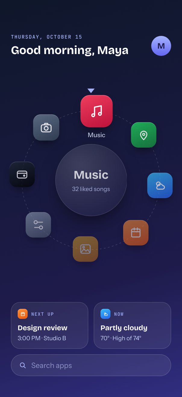
Live demo. Drag it, tap it.
How it works
itemSize60 means every 60 pt of drag turns the dial 45°, andautoplaywithautoplayInterval2000 keeps it turning.translateX= R·sin(value·45°) andtranslateY= −R·cos(value·45°) with R = 0.38 × width put 8 apps on one circle, with the top icon atscale1.3 and the rest fading to opacity 0.45.progressnames the app in the hub, and tapping an icon or widget callsscrollTo({ index })to turn it to the top.
Uses
Full source
import { SceneScreen, useScene } from "@/features/scenes/kit";
import { LinearGradient } from "expo-linear-gradient";
import * as React from "react";
import {
	type StyleProp,
	StyleSheet,
	Text,
	TextInput,
	type TextStyle,
	View,
} from "react-native";
import { Pressable } from "react-native-gesture-handler";
import Animated, {
	Easing,
	Extrapolation,
	type SharedValue,
	interpolate,
	useAnimatedReaction,
	useAnimatedStyle,
	useSharedValue,
	withTiming,
} from "react-native-reanimated";
import {
	Carousel,
	type CarouselAnimation,
	type CarouselItemAnimation,
	type CarouselRef,
	type CarouselRenderItem,
} from "react-native-reanimated-carousel";
import Svg, {
	Circle,
	Defs,
	Path,
	RadialGradient,
	Stop,
} from "react-native-svg";
import { scheduleOnRN } from "react-native-worklets";

type App = {
	name: string;
	detail: string;
	colors: [string, string];
	icon: string;
};

const APPS: App[] = [
	{
		name: "Camera",
		detail: "Photo and video",
		colors: ["#64748B", "#334155"],
		icon: "M6 7h12a3 3 0 0 1 3 3v7a3 3 0 0 1-3 3H6a3 3 0 0 1-3-3v-7a3 3 0 0 1 3-3zM15.5 13.5a3.5 3.5 0 1 1-7 0a3.5 3.5 0 1 1 7 0zM8 7l1.5-2.5h5L16 7",
	},
	{
		name: "Music",
		detail: "32 liked songs",
		colors: ["#F43F5E", "#BE123C"],
		icon: "M9 18V6l10-2v12M9 18a2 2 0 1 1-4 0a2 2 0 1 1 4 0zM19 16a2 2 0 1 1-4 0a2 2 0 1 1 4 0z",
	},
	{
		name: "Maps",
		detail: "Home · 18 min",
		colors: ["#22C55E", "#15803D"],
		icon: "M12 21s-6-5.5-6-10a6 6 0 0 1 12 0c0 4.5-6 10-6 10zM14 11a2 2 0 1 1-4 0a2 2 0 1 1 4 0z",
	},
	{
		name: "Weather",
		detail: "Partly cloudy · 70°",
		colors: ["#38BDF8", "#2563EB"],
		icon: "M12.5 9a3.5 3.5 0 1 1-7 0a3.5 3.5 0 1 1 7 0zM8 19h9a3.5 3.5 0 0 0 0-7a5 5 0 0 0-9.5 1.5A3 3 0 0 0 8 19z",
	},
	{
		name: "Calendar",
		detail: "Review at 3:00 PM",
		colors: ["#FB923C", "#EA580C"],
		icon: "M6 5h12a2 2 0 0 1 2 2v11a2 2 0 0 1-2 2H6a2 2 0 0 1-2-2V7a2 2 0 0 1 2-2zM4 10h16M9 3v4M15 3v4",
	},
	{
		name: "Photos",
		detail: "12 new today",
		colors: ["#FBBF24", "#D97706"],
		icon: "M6 4h12a3 3 0 0 1 3 3v10a3 3 0 0 1-3 3H6a3 3 0 0 1-3-3V7a3 3 0 0 1 3-3zM4 18l5-6 4 4 3-3 4 5M10.1 8.5a1.6 1.6 0 1 1-3.2 0a1.6 1.6 0 1 1 3.2 0z",
	},
	{
		name: "Settings",
		detail: "Wi-Fi · Bluetooth",
		colors: ["#94A3B8", "#475569"],
		icon: "M20 7h-9M14 17H5M20 17a3 3 0 1 1-6 0a3 3 0 1 1 6 0zM10 7a3 3 0 1 1-6 0a3 3 0 1 1 6 0z",
	},
	{
		name: "Wallet",
		detail: "3 cards · 1 pass",
		colors: ["#1F2937", "#000000"],
		icon: "M6 6h12a3 3 0 0 1 3 3v7a3 3 0 0 1-3 3H6a3 3 0 0 1-3-3V9a3 3 0 0 1 3-3zM3 10h18M17.2 14.5a1.2 1.2 0 1 1-2.4 0a1.2 1.2 0 1 1 2.4 0z",
	},
];

const NOW = new Date();
const TODAY = NOW.toLocaleDateString("en-US", {
	weekday: "long",
	month: "long",
	day: "numeric",
});
const GREETING =
	NOW.getHours() < 12
		? "morning"
		: NOW.getHours() < 18
			? "afternoon"
			: "evening";

// Glanceable cards under the dial; tapping one turns its app to the top.
const WIDGETS = [
	{
		app: 4,
		kicker: "NEXT UP",
		title: "Design review",
		detail: "3:00 PM · Studio B",
	},
	{
		app: 3,
		kicker: "NOW",
		title: "Partly cloudy",
		detail: "70° · High of 74°",
	},
];

const ITEM_SIZE = 60; // 60 pt of drag turns the dial by one app
const STEP = (2 * Math.PI) / APPS.length; // 8 apps fill exactly one turn (45° each)
const ICON = 56;
const ANIMATION: CarouselAnimation = {
	type: "timing",
	duration: 700,
	easing: Easing.out(Easing.poly(4)),
};

export default function Scene() {
	return (
		<SceneScreen
			background="#0F172A"
			statusBar="light"
			fonts={[
				"Bricolage-Bold",
				"Instrument-Regular",
				"Instrument-Medium",
				"JetBrainsMono-Medium",
			]}
		>
			<RadialRing />
		</SceneScreen>
	);
}

function RadialRing() {
	const { width, height, insets } = useScene();
	// Ring radius from the width, capped so the dial fits between header and search.
	const radius = Math.min(
		width * 0.38,
		(height - insets.top - insets.bottom - 386) / 2,
	);
	const dialH = radius * 2 + 110;

	const ref = React.useRef<CarouselRef>(null);
	const progress = useSharedValue(0);
	const [index, setIndex] = React.useState(0);
	useAnimatedReaction(
		() => Math.round(progress.value),
		(p, prev) => {
			if (p !== prev)
				scheduleOnRN(setIndex, ((p % APPS.length) + APPS.length) % APPS.length);
		},
	);

	// Value 0 sits at 12 o'clock; every step forward moves 45° clockwise.
	const itemAnimation = React.useCallback<CarouselItemAnimation>(
		(value) => {
			"worklet";
			const d = Math.abs(value);
			return {
				transform: [
					{
						translateX:
							(width - ITEM_SIZE) / 2 + radius * Math.sin(value * STEP),
					},
					{ translateY: -radius * Math.cos(value * STEP) },
					{ scale: interpolate(d, [0, 1], [1.3, 1], Extrapolation.CLAMP) },
				],
				opacity: interpolate(d, [0, 4], [1, 0.45]),
				zIndex: Math.round(10 - d),
			};
		},
		[width, radius],
	);

	const renderItem = React.useCallback<CarouselRenderItem<App>>(
		({ item, index: i, relativeProgress }) => (
			<AppIcon
				app={item}
				relativeProgress={relativeProgress}
				onPress={() => ref.current?.scrollTo({ index: i })}
			/>
		),
		[],
	);

	return (
		<LinearGradient
			colors={["#0F172A", "#1E1B4B", "#312E81"]}
			locations={[0, 0.7, 1]}
			start={{ x: 0.2, y: 0 }}
			end={{ x: 0.8, y: 1 }}
			style={[
				styles.screen,
				{ paddingTop: insets.top, paddingBottom: insets.bottom + 12 },
			]}
		>
			<View style={styles.header}>
				<View style={styles.greeting}>
					<Text style={styles.date}>{TODAY.toUpperCase()}</Text>
					<Text
						style={[styles.hello, { fontSize: Math.min(28, width * 0.064) }]}
					>
						Good {GREETING}, Maya
					</Text>
				</View>
				<LinearGradient colors={["#A5B4FC", "#6366F1"]} style={styles.avatar}>
					<Text style={styles.avatarText}>M</Text>
				</LinearGradient>
			</View>

			<View style={styles.middle}>
				<View style={{ width, height: dialH }}>
					<DialFace radius={radius} height={dialH} app={APPS[index]} />
					<Carousel
						ref={ref}
						loop
						autoplay
						autoplayInterval={2000}
						data={APPS}
						itemSize={ITEM_SIZE}
						style={{ width, height: dialH }}
						progress={progress}
						animation={ANIMATION}
						itemAnimation={itemAnimation}
						renderItem={renderItem}
					/>
				</View>
			</View>

			<View style={styles.widgets}>
				{WIDGETS.map((w) => (
					<Widget
						key={w.app}
						{...w}
						onPress={() => ref.current?.scrollTo({ index: w.app })}
					/>
				))}
			</View>

			<View style={styles.search}>
				<Svg width={18} height={18} viewBox="0 0 24 24" fill="none">
					<Path
						d="M17 11a6 6 0 1 1-12 0a6 6 0 1 1 12 0zM15.5 15.5L20 20"
						stroke="#A5B4FC"
						strokeWidth={2}
						strokeLinecap="round"
					/>
				</Svg>
				<TextInput
					style={styles.searchInput}
					placeholder="Search apps"
					placeholderTextColor="rgba(199,210,254,0.6)"
				/>
			</View>
		</LinearGradient>
	);
}

// Track, top marker and the glass hub naming the app at 12 o'clock.
function DialFace({
	radius,
	height,
	app,
}: {
	radius: number;
	height: number;
	app: App;
}) {
	const hub = radius * 1.04;
	const ring = radius * 2 + 2;
	const markTop = height / 2 - radius - (ICON * 1.3) / 2 - 12;
	return (
		<View style={[StyleSheet.absoluteFill, styles.centered]}>
			<Svg width={ring} height={ring} style={styles.overlay}>
				<Circle
					cx={ring / 2}
					cy={ring / 2}
					r={radius}
					stroke="rgba(255,255,255,0.18)"
					strokeDasharray="4 5"
					fill="none"
				/>
			</Svg>
			<Svg width={16} height={10} style={[styles.overlay, { top: markTop }]}>
				<Path d="M0 0h16L8 10z" fill="#A5B4FC" />
			</Svg>
			<View
				style={[styles.hub, { width: hub, height: hub, borderRadius: hub / 2 }]}
			>
				<Svg width={hub} height={hub} style={styles.overlay}>
					<Defs>
						<RadialGradient id="rg-hub" cx="35%" cy="30%" r="70%">
							<Stop offset="0" stopColor="#FFFFFF" stopOpacity={0.16} />
							<Stop offset="1" stopColor="#FFFFFF" stopOpacity={0.04} />
						</RadialGradient>
					</Defs>
					<Circle
						cx={hub / 2}
						cy={hub / 2}
						r={hub / 2 - 0.5}
						fill="url(#rg-hub)"
						stroke="rgba(255,255,255,0.14)"
					/>
				</Svg>
				<SwapText text={app.name} style={styles.hubName} />
				<SwapText text={app.detail} style={styles.hubDetail} />
			</View>
		</View>
	);
}

function AppGlyph({
	app,
	size,
	radius,
}: {
	app: App;
	size: number;
	radius: number;
}) {
	return (
		<LinearGradient
			colors={app.colors}
			start={{ x: 0.3, y: 0 }}
			end={{ x: 0.7, y: 1 }}
			style={[
				styles.glyph,
				{ width: size, height: size, borderRadius: radius },
			]}
		>
			<Svg width={size / 2} height={size / 2} viewBox="0 0 24 24" fill="none">
				<Path
					d={app.icon}
					stroke="#FFFFFF"
					strokeWidth={size > 30 ? 1.8 : 2.2}
					strokeLinecap="round"
					strokeLinejoin="round"
				/>
			</Svg>
		</LinearGradient>
	);
}

function Widget({
	app,
	kicker,
	title,
	detail,
	onPress,
}: (typeof WIDGETS)[number] & { onPress: () => void }) {
	return (
		<Pressable
			accessibilityRole="button"
			onPress={onPress}
			style={styles.widget}
		>
			<View style={styles.widgetHead}>
				<AppGlyph app={APPS[app]} size={22} radius={7} />
				<Text style={styles.kicker}>{kicker}</Text>
			</View>
			<Text style={styles.widgetTitle} numberOfLines={1}>
				{title}
			</Text>
			<Text style={styles.widgetDetail}>{detail}</Text>
		</Pressable>
	);
}

const AppIcon = React.memo(function AppIcon({
	app,
	relativeProgress,
	onPress,
}: {
	app: App;
	relativeProgress: SharedValue<number>;
	onPress: () => void;
}) {
	const label = useAnimatedStyle(() => ({
		opacity: Math.max(0, 1 - Math.abs(relativeProgress.value) * 1.6),
	}));
	return (
		<View style={styles.slot}>
			<Pressable
				accessibilityRole="button"
				accessibilityLabel={app.name}
				onPress={onPress}
			>
				<AppGlyph app={app} size={ICON} radius={16} />
			</Pressable>
			<Animated.Text style={[styles.label, label]}>{app.name}</Animated.Text>
		</View>
	);
});

// Fades and lifts text in whenever it changes.
function SwapText({
	text,
	style,
}: {
	text: string;
	style: StyleProp<TextStyle>;
}) {
	const shown = useSharedValue(1);
	React.useEffect(() => {
		shown.value = 0;
		shown.value = withTiming(1, {
			duration: 350,
			easing: Easing.out(Easing.quad),
		});
	}, [text, shown]);
	const anim = useAnimatedStyle(() => ({
		opacity: shown.value,
		transform: [{ translateY: (1 - shown.value) * 6 }],
	}));
	return <Animated.Text style={[style, anim]}>{text}</Animated.Text>;
}

const styles = StyleSheet.create({
	screen: { flex: 1 },
	centered: { alignItems: "center", justifyContent: "center" },
	overlay: { position: "absolute" },
	header: {
		flexDirection: "row",
		alignItems: "center",
		justifyContent: "space-between",
		paddingHorizontal: 24,
		paddingTop: 12,
	},
	greeting: { flex: 1, gap: 6 },
	date: {
		fontFamily: "JetBrainsMono-Medium",
		fontSize: 11,
		letterSpacing: 1.3,
		color: "#A5B4FC",
	},
	hello: { fontFamily: "Bricolage-Bold", lineHeight: 34, color: "#FFFFFF" },
	avatar: {
		width: 44,
		height: 44,
		borderRadius: 22,
		alignItems: "center",
		justifyContent: "center",
	},
	avatarText: { fontFamily: "Bricolage-Bold", fontSize: 18, color: "#1E1B4B" },
	middle: { flex: 1, justifyContent: "center" },
	hub: {
		alignItems: "center",
		justifyContent: "center",
		gap: 6,
		paddingHorizontal: 14,
		boxShadow: "0 20px 50px -20px rgba(0,0,0,0.8)",
	},
	hubName: {
		fontFamily: "Bricolage-Bold",
		fontSize: 26,
		lineHeight: 30,
		color: "#FFFFFF",
	},
	hubDetail: {
		fontFamily: "Instrument-Regular",
		fontSize: 13,
		lineHeight: 18,
		color: "#C7D2FE",
		textAlign: "center",
	},
	slot: {
		flex: 1,
		alignItems: "center",
		justifyContent: "center",
		pointerEvents: "box-none",
	},
	glyph: {
		alignItems: "center",
		justifyContent: "center",
		boxShadow:
			"inset 0 1px 0 rgba(255,255,255,0.25), 0 10px 20px -8px rgba(0,0,0,0.7)",
	},
	label: {
		position: "absolute",
		top: "50%",
		marginTop: ICON / 2 + 6,
		width: 120,
		textAlign: "center",
		fontFamily: "Instrument-Medium",
		fontSize: 11,
		color: "#E0E7FF",
	},
	widgets: {
		flexDirection: "row",
		gap: 12,
		marginHorizontal: 24,
		marginBottom: 12,
	},
	widget: {
		flex: 1,
		gap: 4,
		padding: 14,
		borderRadius: 20,
		backgroundColor: "rgba(255,255,255,0.07)",
		borderWidth: StyleSheet.hairlineWidth,
		borderColor: "rgba(255,255,255,0.14)",
	},
	widgetHead: {
		flexDirection: "row",
		alignItems: "center",
		gap: 8,
		marginBottom: 6,
	},
	kicker: {
		fontFamily: "JetBrainsMono-Medium",
		fontSize: 10,
		letterSpacing: 1.2,
		color: "#A5B4FC",
	},
	widgetTitle: {
		fontFamily: "Bricolage-Bold",
		fontSize: 16,
		lineHeight: 20,
		color: "#FFFFFF",
	},
	widgetDetail: {
		fontFamily: "Instrument-Regular",
		fontSize: 13,
		lineHeight: 17,
		color: "#C7D2FE",
	},
	search: {
		flexDirection: "row",
		alignItems: "center",
		gap: 10,
		height: 48,
		marginHorizontal: 24,
		paddingHorizontal: 16,
		borderRadius: 24,
		backgroundColor: "rgba(255,255,255,0.08)",
		borderWidth: StyleSheet.hairlineWidth,
		borderColor: "rgba(255,255,255,0.16)",
	},
	searchInput: {
		flex: 1,
		fontFamily: "Instrument-Regular",
		fontSize: 16,
		color: "#FFFFFF",
	},
});