Level Select
Neon level picker with 3D cards, a parallax starfield and a sliding retro grid.
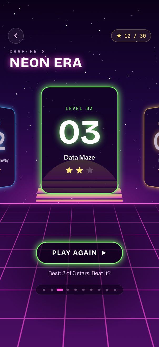
Live demo. Drag it, tap it.
How it works
itemAnimationspaces cards byitemSize, drops neighbors 18 pt and scales them to 0.78; each card turns ±35° from itsrelativeProgress.defaultIndex={5}opens on the newest level, andonSnapToItemflipsautoplayDirectionat either end.- Three star layers and the floor grid slide by
progress× 10, 25, 45 and 60 for depth.
Uses
Full source
import type { SceneFont } from "@/features/scenes/fonts";
import { SceneScreen, useScene } from "@/features/scenes/kit";
import { LinearGradient } from "expo-linear-gradient";
import * as React from "react";
import { Pressable, StyleSheet, Text, View } from "react-native";
import { Gesture, GestureDetector } from "react-native-gesture-handler";
import Animated, {
	Easing,
	Extrapolation,
	FadeInDown,
	type SharedValue,
	interpolate,
	useAnimatedReaction,
	useAnimatedStyle,
	useSharedValue,
} from "react-native-reanimated";
import {
	Carousel,
	type CarouselItemAnimation,
	type CarouselRef,
	type CarouselRenderItem,
	Pagination,
} from "react-native-reanimated-carousel";
import Svg, {
	Circle,
	ClipPath,
	Defs,
	G,
	Path,
	RadialGradient,
	Rect,
	Stop,
	LinearGradient as SvgGradient,
} from "react-native-svg";
import { scheduleOnRN } from "react-native-worklets";

interface Level {
	name: string;
	color: string;
	/** Stars earned, 0 to 3. */
	stars?: number;
	locked?: boolean;
	fresh?: boolean;
}

const LEVELS: Level[] = [
	{ name: "Neon Blocks", stars: 3, color: "#FF4FD8" },
	{ name: "Midnight Highway", stars: 3, color: "#4FC3FF" },
	{ name: "Data Maze", stars: 2, color: "#7CFF6B" },
	{ name: "Pixel Bay", stars: 3, color: "#FFD34F" },
	{ name: "Glitch Forest", stars: 1, color: "#FF7A4F" },
	{ name: "Quantum Factory", stars: 0, color: "#B48CFF", fresh: true },
	{ name: "Mirror Desert", locked: true, color: "#6B6B8A" },
	{ name: "Echo Abyss", locked: true, color: "#6B6B8A" },
	{ name: "Zero Space", locked: true, color: "#6B6B8A" },
	{ name: "The Core", locked: true, color: "#6B6B8A" },
];
const EARNED = LEVELS.reduce((sum, level) => sum + (level.stars ?? 0), 0);

const STAR =
	"M12 2l2.9 6.3 6.9.8-5.1 4.7 1.4 6.8L12 17.2l-6.1 3.4 1.4-6.8L2.2 9.1l6.9-.8z";
const pad = (n: number) => String(n).padStart(2, "0");

// Three star layers; nearer layers have bigger stars and slide farther per level.
const STAR_LAYERS = [
	{
		seed: 3,
		count: 90,
		size: [0.5, 0.9],
		color: "#FFFFFF",
		opacity: 0.45,
		speed: 10,
	},
	{
		seed: 7,
		count: 45,
		size: [0.8, 1.2],
		color: "#E9D5FF",
		opacity: 0.65,
		speed: 25,
	},
	{
		seed: 11,
		count: 24,
		size: [1.1, 1.6],
		color: "#FFFFFF",
		opacity: 0.9,
		speed: 45,
	},
];

function starPath(
	seed: number,
	count: number,
	[min, max]: number[],
	w: number,
	h: number,
) {
	let s = seed;
	const rand = () => {
		s = (Math.imul(s, 1664525) + 1013904223) >>> 0;
		return s / 4294967296;
	};
	let d = "";
	for (let i = 0; i < count; i++) {
		const [x, y, r] = [rand() * w, rand() * h, min + rand() * (max - min)];
		d += `M${(x - r).toFixed(1)} ${y.toFixed(1)}a${r} ${r} 0 1 0 ${2 * r} 0a${r} ${r} 0 1 0 ${-2 * r} 0`;
	}
	return d;
}

type StarLayerProps = {
	layer: (typeof STAR_LAYERS)[number];
	progress: SharedValue<number>;
	width: number;
	height: number;
};
function StarLayer({ layer, progress, width, height }: StarLayerProps) {
	const { seed, count, size, color, opacity, speed } = layer;
	const w = width + speed * LEVELS.length;
	const d = React.useMemo(
		() => starPath(seed, (count * w) / 400, size, w, height),
		[w, height],
	);
	const style = useAnimatedStyle(() => ({
		transform: [{ translateX: -progress.value * speed }],
	}));
	return (
		<Animated.View style={[styles.layer, style]}>
			<Svg width={w} height={height}>
				<Path d={d} fill={color} opacity={opacity} />
			</Svg>
		</Animated.View>
	);
}

function Sun({ radius }: { radius: number }) {
	// Synthwave sun: a half disc cut into bands that get thinner toward the horizon.
	const bands = [
		[0, 0.46],
		[0.5, 0.62],
		[0.66, 0.76],
		[0.8, 0.88],
		[0.92, 0.98],
	];
	const glow = radius * 1.8;
	return (
		<Svg width={glow * 2} height={glow}>
			<Defs>
				<RadialGradient id="glow" cx="50%" cy="100%" r="50%">
					<Stop offset="0" stopColor="#FF4FD8" stopOpacity={0.35} />
					<Stop offset="1" stopColor="#FF4FD8" stopOpacity={0} />
				</RadialGradient>
				<SvgGradient id="sun" x1="0" y1="0" x2="0" y2="1">
					<Stop offset="0" stopColor="#FFE27A" />
					<Stop offset="1" stopColor="#FF4FD8" />
				</SvgGradient>
				<ClipPath id="disc">
					<Circle cx={glow} cy={glow} r={radius} />
				</ClipPath>
			</Defs>
			<Rect width={glow * 2} height={glow} fill="url(#glow)" />
			<G clipPath="url(#disc)" opacity={0.85}>
				{bands.map(([from, to]) => (
					<Rect
						key={from}
						x={glow - radius}
						y={glow - radius + from * radius}
						width={radius * 2}
						height={(to - from) * radius}
						fill="url(#sun)"
					/>
				))}
			</G>
		</Svg>
	);
}

/** A flat grid tilted back in 3D; it slides sideways with progress. */
function Floor({
	progress,
	width,
	height,
	unit,
}: {
	progress: SharedValue<number>;
	width: number;
	height: number;
	unit: number;
}) {
	const half = height * 0.9;
	const perspective = half * 2.2;
	const tilt = Math.PI / 3;
	// Where the plane's far edge lands once tilted, so it can be lifted onto the horizon.
	const far =
		(half * Math.cos(tilt) * perspective) /
		(perspective + half * Math.sin(tilt));
	const [planeW, cell] = [width * 2.4, Math.round(72 * unit)];
	const slideStyle = useAnimatedStyle(() => {
		const x = (progress.value * 60 * unit) % cell;
		return { transform: [{ translateX: -(x < 0 ? x + cell : x) }] };
	});
	const lines = React.useMemo(() => {
		let d = "";
		for (let x = 0; x <= planeW + cell; x += cell) d += `M${x} 0V${half * 2}`;
		for (let y = half * 2; y > 0; y -= half / 4)
			d += `M0 ${y}H${planeW + cell}`;
		return d;
	}, [planeW, cell, half]);
	return (
		<View style={[styles.floor, { height }]}>
			<LinearGradient
				colors={["#2A0640", "#4A0D63"]}
				style={StyleSheet.absoluteFill}
			/>
			<View
				style={[
					styles.plane,
					{
						top: far - half,
						left: (width - planeW) / 2,
						width: planeW,
						height: half * 2,
						transform: [{ perspective }, { rotateX: `${tilt}rad` }],
					},
				]}
			>
				<Animated.View style={slideStyle}>
					<Svg width={planeW + cell} height={half * 2}>
						<Path
							d={lines}
							stroke="#FF4FD8"
							strokeOpacity={0.7}
							strokeWidth={2}
						/>
					</Svg>
				</Animated.View>
			</View>
			<LinearGradient
				colors={["#2A0640", "#2A064000"]}
				style={styles.horizonFade}
			/>
			<View style={styles.horizonLine} />
		</View>
	);
}

function Lock({ size }: { size: number }) {
	return (
		<Svg width={size} height={size * 1.18} viewBox="0 0 44 52">
			<Path
				d="M11 22v-7a11 11 0 0 1 22 0v7"
				stroke="#A1A1C2"
				strokeWidth={5}
				fill="none"
			/>
			<Rect x={0} y={20} width={44} height={32} rx={8} fill="#A1A1C2" />
		</Svg>
	);
}

type LevelCardProps = {
	level: Level;
	number: number;
	width: number;
	height: number;
	relativeProgress: SharedValue<number>;
	onSelect: (index: number) => void;
};
const LevelCard = React.memo(function LevelCard({
	level,
	number,
	width,
	height,
	relativeProgress,
	onSelect,
}: LevelCardProps) {
	// A Tap gesture fails once the finger moves 10 pt, so swiping never selects a card.
	const tap = React.useMemo(
		() =>
			Gesture.Tap()
				.maxDistance(10)
				.runOnJS(true)
				.onEnd((_event, success) => {
					if (success) onSelect(number - 1);
				}),
		[number, onSelect],
	);
	// Each card turns in its own perspective, so neighbors swing around their own centers.
	const turnStyle = useAnimatedStyle(() => ({
		transform: [
			{ perspective: width * 3 },
			{
				rotateY: `${interpolate(relativeProgress.value, [-1, 0, 1], [35, 0, -35], Extrapolation.CLAMP)}deg`,
			},
		],
	}));
	const { color, locked } = level;
	return (
		<Animated.View style={[{ width, height }, turnStyle]}>
			<GestureDetector gesture={tap}>
				<View
					accessibilityRole="button"
					accessibilityLabel={`Level ${number}`}
					style={[
						styles.card,
						{ borderColor: color },
						!locked && { boxShadow: `0 0 18px ${color}` },
					]}
				>
					<Text style={[styles.cardKicker, { color }]}>
						LEVEL {pad(number)}
					</Text>
					<Text
						style={[
							styles.cardNumber,
							{ fontSize: width * 0.44, lineHeight: width * 0.48 },
							locked
								? styles.dim
								: { textShadowColor: color, textShadowRadius: 18 },
						]}
					>
						{pad(number)}
					</Text>
					<Text
						style={[styles.cardName, locked && styles.dim]}
						numberOfLines={1}
					>
						{level.name}
					</Text>
					{locked ? (
						<View style={styles.lock}>
							<Lock size={width * 0.22} />
						</View>
					) : (
						<View style={styles.cardStars}>
							{[0, 1, 2].map((k) => (
								<Svg key={k} width={22} height={22} viewBox="0 0 24 24">
									<Path
										d={STAR}
										fill={k < (level.stars ?? 0) ? "#FFE27A" : "#FFFFFF33"}
									/>
								</Svg>
							))}
						</View>
					)}
					{level.fresh && (
						<Text style={[styles.badge, { backgroundColor: color }]}>NEW</Text>
					)}
				</View>
			</GestureDetector>
		</Animated.View>
	);
});

function PlayButton({ level, number }: { level: Level; number: number }) {
	const { locked, stars, color } = level;
	const label = locked ? "Locked" : stars ? "Play again" : "Play";
	const hint = locked
		? `Clear level ${number - 1} to unlock`
		: stars
			? `Best: ${stars} of 3 stars. Beat it?`
			: "New level. Not played yet.";
	return (
		<>
			<Pressable
				disabled={locked}
				style={({ pressed }) => [
					styles.button,
					{
						borderColor: color,
						boxShadow: locked ? "none" : `0 0 16px ${color}`,
					},
					pressed && styles.pressed,
				]}
			>
				<Animated.Text
					key={label}
					entering={FadeInDown.duration(220)}
					style={[styles.buttonText, locked && styles.buttonLocked]}
				>
					{label.toUpperCase()}
				</Animated.Text>
				{!locked && (
					<Svg width={14} height={14} viewBox="0 0 14 14">
						<Path d="M2 1.5v11l10-5.5z" fill="#fff" />
					</Svg>
				)}
			</Pressable>
			<Animated.Text
				key={hint}
				entering={FadeInDown.duration(220)}
				style={styles.hint}
			>
				{hint}
			</Animated.Text>
		</>
	);
}

function LevelSelect() {
	const { width, height, insets } = useScene();
	const carousel = React.useRef<CarouselRef>(null);
	const progress = useSharedValue(5);
	const [index, setIndex] = React.useState(5);
	const [direction, setDirection] = React.useState<"forward" | "backward">(
		"forward",
	);

	const unit = width / 402;
	const cardW = Math.round(196 * unit);
	const cardH = Math.round(cardW * 1.38);
	const itemSize = cardW + 24;
	const carouselH = cardH + 64;
	const carouselTop = insets.top + 124;
	const horizon = carouselTop + (carouselH + cardH) / 2 + 24;

	// Swap the button text as soon as a new level is under the center, not only when it settles.
	useAnimatedReaction(
		() => Math.min(LEVELS.length - 1, Math.max(0, Math.round(progress.value))),
		(now, before) => {
			if (now !== before) scheduleOnRN(setIndex, now);
		},
	);

	const itemAnimation = React.useCallback<CarouselItemAnimation>(
		(value) => {
			"worklet";
			const d = Math.abs(value);
			return {
				transform: [
					{ translateX: value * itemSize + (width - itemSize) / 2 },
					{ translateY: interpolate(d, [0, 1], [0, 18], Extrapolation.CLAMP) },
					{ scale: interpolate(d, [0, 1], [1, 0.78], Extrapolation.CLAMP) },
				],
				opacity: interpolate(d, [0, 1, 2], [1, 0.7, 0.25], Extrapolation.CLAMP),
				zIndex: Math.round(100 - d * 10),
			};
		},
		[width, itemSize],
	);

	const select = React.useCallback(
		(index: number) => carousel.current?.scrollTo({ index }),
		[],
	);
	const renderItem = React.useCallback<CarouselRenderItem<Level>>(
		({ item, index: i, relativeProgress }) => (
			<View style={styles.slot}>
				<LevelCard
					level={item}
					number={i + 1}
					width={cardW}
					height={cardH}
					relativeProgress={relativeProgress}
					onSelect={select}
				/>
			</View>
		),
		[cardW, cardH, select],
	);

	// Autoplay runs to the last level, then turns around.
	const onSnapToItem = React.useCallback((i: number) => {
		if (i === LEVELS.length - 1) setDirection("backward");
		if (i === 0) setDirection("forward");
	}, []);

	return (
		<View style={StyleSheet.absoluteFill}>
			<LinearGradient
				colors={["#0B0019", "#1E0640", "#4A0D63"]}
				locations={[0, 0.55, 1]}
				style={[styles.sky, { height: horizon }]}
			/>
			<View style={[styles.sky, { height: horizon }]}>
				{STAR_LAYERS.map((layer) => (
					<StarLayer
						key={layer.seed}
						layer={layer}
						progress={progress}
						width={width}
						height={horizon}
					/>
				))}
				<View style={styles.sun}>
					<Sun radius={cardW * 0.56} />
				</View>
			</View>
			<View style={[styles.below, { top: horizon }]}>
				<Floor
					progress={progress}
					width={width}
					height={height - horizon}
					unit={unit}
				/>
			</View>

			<View style={[styles.hud, { marginTop: insets.top + 8 }]}>
				<View style={styles.round}>
					<Svg width={22} height={22} viewBox="0 0 24 24">
						<Path
							d="M15 18l-6-6 6-6"
							stroke="#F5D0FE"
							strokeWidth={2.2}
							strokeLinecap="round"
							strokeLinejoin="round"
							fill="none"
						/>
					</Svg>
				</View>
				<View style={styles.pill}>
					<Svg width={14} height={14} viewBox="0 0 24 24">
						<Path d={STAR} fill="#FFE27A" />
					</Svg>
					<Text style={styles.pillText}>
						{EARNED} / {LEVELS.length * 3}
					</Text>
				</View>
			</View>
			<View style={styles.titleBlock}>
				<Text style={styles.kicker}>CHAPTER 2</Text>
				<Text style={styles.title}>NEON ERA</Text>
			</View>

			<Carousel
				ref={carousel}
				data={LEVELS}
				defaultIndex={5}
				autoplay
				autoplayInterval={1800}
				autoplayDirection={direction}
				itemSize={itemSize}
				style={{
					position: "absolute",
					top: carouselTop,
					width,
					height: carouselH,
				}}
				progress={progress}
				animation={{
					type: "timing",
					duration: 650,
					easing: Easing.out(Easing.poly(4)),
				}}
				itemAnimation={itemAnimation}
				onSnapToItem={onSnapToItem}
				renderItem={renderItem}
			/>

			<View style={[styles.foot, { top: horizon, bottom: insets.bottom }]}>
				<Svg width="100%" height="100%" style={StyleSheet.absoluteFill}>
					<Defs>
						<RadialGradient id="scrim">
							<Stop offset="0" stopColor="#12021F" stopOpacity={0.8} />
							<Stop offset="1" stopColor="#12021F" stopOpacity={0} />
						</RadialGradient>
					</Defs>
					<Rect width="100%" height="100%" fill="url(#scrim)" />
				</Svg>
				<PlayButton level={LEVELS[index]} number={index + 1} />
				<Pagination
					count={LEVELS.length}
					progress={progress}
					onPress={(i) => carousel.current?.scrollTo({ index: i })}
					containerStyle={styles.dots}
					dotStyle={{
						width: 6,
						height: 6,
						borderRadius: 3,
						backgroundColor: "#F5D0FE59",
					}}
					activeDotStyle={{ width: 16, backgroundColor: "#FF4FD8" }}
				/>
			</View>
		</View>
	);
}

const FONTS: SceneFont[] = [
	"Bricolage-Bold",
	"Bricolage-ExtraBold",
	"Instrument-Regular",
	"Instrument-SemiBold",
	"JetBrainsMono-Medium",
	"JetBrainsMono-Bold",
];

export default function Scene() {
	return (
		<SceneScreen background="#0B0019" statusBar="light" fonts={FONTS}>
			<LevelSelect />
		</SceneScreen>
	);
}

const font = (
	fontFamily: SceneFont,
	fontSize: number,
	color: string,
	lineHeight?: number,
) => ({
	fontFamily,
	fontSize,
	color,
	lineHeight,
});

const center = { alignItems: "center", justifyContent: "center" } as const;

const styles = StyleSheet.create({
	sky: { position: "absolute", left: 0, right: 0, top: 0, overflow: "hidden" },
	layer: { position: "absolute", left: 0, top: 0 },
	sun: {
		position: "absolute",
		left: 0,
		right: 0,
		bottom: 0,
		alignItems: "center",
	},
	below: { position: "absolute", left: 0, right: 0, bottom: 0 },
	floor: { overflow: "hidden" },
	plane: { position: "absolute", overflow: "hidden" },
	horizonFade: { position: "absolute", left: 0, right: 0, top: 0, height: 40 },
	horizonLine: {
		position: "absolute",
		left: 0,
		right: 0,
		top: 0,
		height: 2,
		backgroundColor: "#FF4FD8",
		boxShadow: "0 0 12px #FF4FD8",
	},
	hud: {
		flexDirection: "row",
		justifyContent: "space-between",
		alignItems: "center",
		paddingHorizontal: 20,
	},
	round: {
		...center,
		width: 40,
		height: 40,
		borderRadius: 20,
		borderWidth: 1.5,
		borderColor: "#F5D0FE40",
		backgroundColor: "#FFFFFF0F",
	},
	pill: {
		flexDirection: "row",
		alignItems: "center",
		gap: 6,
		height: 32,
		paddingHorizontal: 12,
		borderRadius: 16,
		borderWidth: 1,
		borderColor: "#FFE27A55",
		backgroundColor: "#FFE27A14",
	},
	pillText: font("JetBrainsMono-Medium", 13, "#FFE27A"),
	titleBlock: { marginTop: 12, paddingHorizontal: 24 },
	kicker: {
		...font("JetBrainsMono-Medium", 12, "#F5D0FE", 16),
		letterSpacing: 3,
		opacity: 0.75,
	},
	title: {
		...font("Bricolage-ExtraBold", 34, "#FFFFFF", 40),
		letterSpacing: 1,
		textShadowColor: "#FF4FD8",
		textShadowRadius: 16,
	},
	slot: { ...center, flex: 1 },
	card: {
		...center,
		flex: 1,
		gap: 6,
		borderRadius: 22,
		borderWidth: 2,
		backgroundColor: "rgba(18, 2, 36, 0.78)",
	},
	cardKicker: {
		...font("JetBrainsMono-Medium", 11, "#fff", 14),
		letterSpacing: 2.2,
	},
	cardNumber: { fontFamily: "Bricolage-Bold", color: "#fff" },
	cardName: { ...font("Instrument-SemiBold", 16, "#fff", 20), maxWidth: "88%" },
	cardStars: { flexDirection: "row", gap: 4, marginTop: 6 },
	dim: { opacity: 0.35 },
	lock: { ...StyleSheet.absoluteFillObject, ...center, paddingTop: 18 },
	badge: {
		...font("JetBrainsMono-Bold", 10, "#12021F", 12),
		position: "absolute",
		top: 14,
		right: 14,
		paddingHorizontal: 6,
		paddingVertical: 3,
		borderRadius: 4,
		overflow: "hidden",
	},
	foot: { ...center, position: "absolute", left: 0, right: 0, gap: 14 },
	button: {
		minWidth: 220,
		height: 56,
		paddingHorizontal: 32,
		borderRadius: 28,
		borderWidth: 2,
		...center,
		flexDirection: "row",
		gap: 10,
		backgroundColor: "rgba(10, 0, 20, 0.6)",
	},
	pressed: { transform: [{ scale: 0.97 }] },
	buttonText: { ...font("Bricolage-Bold", 17, "#fff", 22), letterSpacing: 1.5 },
	buttonLocked: { color: "#A1A1C2" },
	hint: font("Instrument-Regular", 14, "#F5D0FE", 18),
	dots: {
		gap: 4,
		marginTop: 6,
		paddingHorizontal: 12,
		paddingVertical: 9,
		borderRadius: 14,
		backgroundColor: "#12021FB3",
		borderWidth: 1,
		borderColor: "#F5D0FE1F",
	},
});