Mood Rating
A daily check-in whose big face morphs continuously with the carousel's progress.
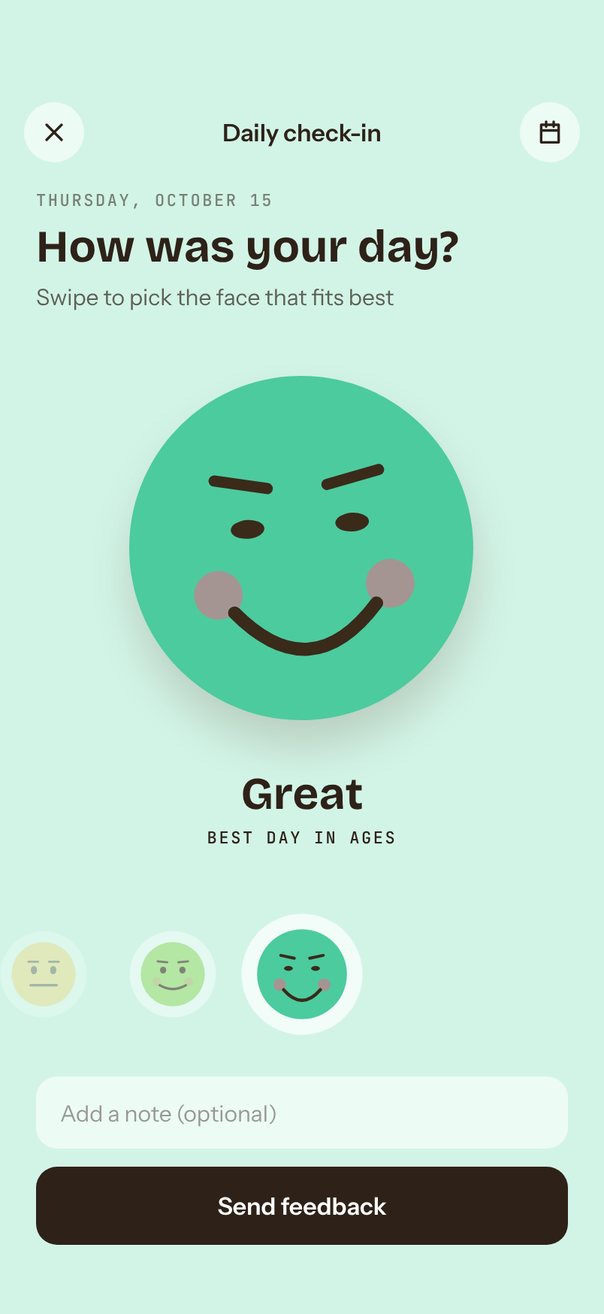
Live demo. Drag it, tap it.
How it works
- Five faces sit in a
loop={false}carousel withitemSize86 anddefaultIndex3;itemAnimationscales the centered face to 1.15 and fades its neighbors to 0.55 and 0.3. - The
progressshared value drives the big face on the UI thread: mouth curve, eye height, brow tilt, blush, tear, face color and background are all interpolated from it. - Until the first touch,
autoplayevery 1600 ms ping-pongs by flippingautoplayDirectionat both ends; tapping a small face callsscrollTo({ index }).
Uses
Full source
import { SceneScreen, useScene } from "@/features/scenes/kit";
import * as Haptics from "expo-haptics";
import * as React from "react";
import {
	Pressable,
	type StyleProp,
	StyleSheet,
	Text,
	TextInput,
	type TextStyle,
	View,
} from "react-native";
import { Pressable as GesturePressable } from "react-native-gesture-handler";
import Animated, {
	Easing,
	Extrapolation,
	type SharedValue,
	interpolate,
	interpolateColor,
	useAnimatedProps,
	useAnimatedReaction,
	useAnimatedStyle,
	useDerivedValue,
	useSharedValue,
	withTiming,
} from "react-native-reanimated";
import {
	Carousel,
	type CarouselAnimation,
	type CarouselItemAnimation,
	type CarouselPanGesture,
	type CarouselRef,
	type CarouselRenderItem,
} from "react-native-reanimated-carousel";
import Svg, { Circle, Ellipse, Path } from "react-native-svg";
import { scheduleOnRN } from "react-native-worklets";

const MOODS = [
	{ title: "Awful", note: "Rough day", face: "#FF7B7B", bg: "#FFE0E0" },
	{
		title: "Not great",
		note: "Could be better",
		face: "#FFA36B",
		bg: "#FFEAD8",
	},
	{ title: "Okay", note: "Just fine", face: "#FFD25C", bg: "#FFF5CC" },
	{ title: "Good", note: "Pretty nice", face: "#9CDB6E", bg: "#E6F7D8" },
	{ title: "Great", note: "Best day in ages", face: "#4CCB9E", bg: "#D2F4E7" },
];
const STEPS = MOODS.map((_, i) => i);
const BACKDROPS = MOODS.map((m) => m.bg);
const FACES = MOODS.map((m) => m.face);
const LAST = MOODS.length - 1;
const START = 3;
const ITEM_SIZE = 86;
const INK = "#2E2218";
const FEATURE = "#3A2A1A";
const TODAY = new Date().toLocaleDateString("en-US", {
	weekday: "long",
	month: "long",
	day: "numeric",
});
const ANIMATION: CarouselAnimation = {
	type: "timing",
	duration: 700,
	easing: Easing.out(Easing.poly(4)),
};

type Mood = (typeof MOODS)[number];

const AnimatedPath = Animated.createAnimatedComponent(Path);
const AnimatedEllipse = Animated.createAnimatedComponent(Ellipse);
const AnimatedCircle = Animated.createAnimatedComponent(Circle);

// Every feature of the face is a function of mood m: 0 = awful, 1 = great.
function faceParts(m: number) {
	"worklet";
	const t = interpolate(m, [0, 0.5, 1], [9, 0, -3]); // brow tilt
	return {
		mouth: `M 62 132 Q 100 ${132 + interpolate(m, [0, 0.5, 1], [-34, 0, 44])} 138 132`,
		brows: `M 56 ${64 + t} L 84 ${64 - t} M 116 ${64 - t} L 144 ${64 + t}`,
		eyeRy: interpolate(m, [0, 0.5, 0.85, 1], [11, 12, 9, 5]),
		blush: interpolate(m, [0.55, 1], [0, 0.5], Extrapolation.CLAMP),
		tear: interpolate(m, [0, 0.2], [0.85, 0], Extrapolation.CLAMP),
	};
}

export default function Scene() {
	return (
		<SceneScreen
			background={MOODS[START].bg}
			statusBar="dark"
			fonts={[
				"Bricolage-Bold",
				"Instrument-Regular",
				"Instrument-SemiBold",
				"JetBrainsMono-Medium",
			]}
		>
			<MoodRating />
		</SceneScreen>
	);
}

function MoodRating() {
	const { width, height, insets } = useScene();
	const faceSize = Math.min(
		width * 0.62,
		height - insets.top - insets.bottom - 480,
	);

	const ref = React.useRef<CarouselRef>(null);
	const progress = useSharedValue(START);
	const mood = useDerivedValue(
		() => Math.min(LAST, Math.max(0, progress.value)) / LAST,
	);
	const [index, setIndex] = React.useState(START);
	const [sent, setSent] = React.useState(false);

	// Labels follow the nearest face while dragging, not only after the snap.
	useAnimatedReaction(
		() => Math.round(Math.min(LAST, Math.max(0, progress.value))),
		(i, prev) => {
			if (i !== prev) scheduleOnRN(setIndex, i);
		},
	);
	React.useEffect(() => setSent(false), [index]);

	const backdrop = useAnimatedStyle(() => ({
		backgroundColor: interpolateColor(progress.value, STEPS, BACKDROPS),
	}));

	const itemAnimation = React.useCallback<CarouselItemAnimation>(
		(value) => {
			"worklet";
			const d = Math.abs(value);
			return {
				transform: [
					{ translateX: value * ITEM_SIZE + (width - ITEM_SIZE) / 2 },
					{ scale: interpolate(d, [0, 1], [1.15, 0.82], Extrapolation.CLAMP) },
				],
				opacity: interpolate(d, [0, 1, 2], [1, 0.55, 0.3], Extrapolation.CLAMP),
			};
		},
		[width],
	);

	// Until the user steps in, the faces ping-pong on their own as a hint. A drag
	// only flags it; the hint stops once the drag settles, because changing props
	// mid-drag would rebuild the carousel's pan gesture.
	const [demo, setDemo] = React.useState(true);
	const [direction, setDirection] = React.useState<"forward" | "backward">(
		"forward",
	);
	const dragged = React.useRef(false);
	const stopDemo = React.useCallback(() => setDemo(false), []);
	const onDragBegin = React.useCallback(() => {
		dragged.current = true;
	}, []);
	const configurePan = React.useCallback(
		(pan: CarouselPanGesture) => {
			pan.onBegin(() => {
				"worklet";
				scheduleOnRN(onDragBegin);
			});
		},
		[onDragBegin],
	);
	const onSnapToItem = React.useCallback((i: number) => {
		if (dragged.current) setDemo(false);
		else if (i === LAST) setDirection("backward");
		else if (i === 0) setDirection("forward");
	}, []);
	const renderItem = React.useCallback<CarouselRenderItem<Mood>>(
		({ item, index: i }) => (
			<MiniFace
				mood={item}
				m={i / LAST}
				onPress={() => {
					stopDemo();
					ref.current?.scrollTo({ index: i });
				}}
			/>
		),
		[stopDemo],
	);

	return (
		<Animated.View
			style={[styles.screen, backdrop, { paddingTop: insets.top }]}
		>
			<View style={styles.topBar}>
				<IconButton d="M6 6l12 12M18 6L6 18" />
				<Text style={styles.topTitle}>Daily check-in</Text>
				<IconButton d="M5 6h14v14H5zM5 10.5h14M9 3.5v4M15 3.5v4" />
			</View>

			<View style={styles.header}>
				<Text style={styles.date}>{TODAY.toUpperCase()}</Text>
				<Text style={styles.question}>How was your day?</Text>
				<Text style={styles.hint}>Swipe to pick the face that fits best</Text>
			</View>

			<View style={styles.hero}>
				<BigFace progress={progress} mood={mood} size={faceSize} />
				<SwapText text={MOODS[index].title} style={styles.moodTitle} />
				<SwapText
					text={MOODS[index].note.toUpperCase()}
					style={styles.moodNote}
				/>
			</View>

			<Carousel
				ref={ref}
				data={MOODS}
				loop={false}
				defaultIndex={START}
				itemSize={ITEM_SIZE}
				style={{ width, height: 104 }}
				progress={progress}
				autoplay={demo}
				autoplayInterval={1600}
				autoplayDirection={direction}
				animation={ANIMATION}
				onConfigurePanGesture={configurePan}
				onSnapToItem={onSnapToItem}
				itemAnimation={itemAnimation}
				renderItem={renderItem}
			/>

			<View style={[styles.footer, { paddingBottom: insets.bottom + 12 }]}>
				<TextInput
					style={styles.note}
					placeholder="Add a note (optional)"
					placeholderTextColor="rgba(46,34,24,0.45)"
					onFocus={stopDemo}
				/>
				<Pressable
					accessibilityRole="button"
					onPress={() => {
						stopDemo();
						setSent(true);
						Haptics.notificationAsync(Haptics.NotificationFeedbackType.Success);
					}}
					style={({ pressed }) => [
						styles.send,
						{ opacity: pressed ? 0.85 : 1 },
					]}
				>
					<Text style={styles.sendText}>
						{sent ? "Thanks for sharing!" : "Send feedback"}
					</Text>
				</Pressable>
			</View>
		</Animated.View>
	);
}

function BigFace({
	progress,
	mood,
	size,
}: {
	progress: SharedValue<number>;
	mood: SharedValue<number>;
	size: number;
}) {
	const tilt = useAnimatedStyle(() => ({
		transform: [{ rotate: `${(mood.value - 0.5) * -8}deg` }],
	}));
	const fill = useAnimatedStyle(() => ({
		backgroundColor: interpolateColor(progress.value, STEPS, FACES),
	}));
	const disc = size * 0.92;

	return (
		<Animated.View style={[{ width: size, height: size }, styles.center, tilt]}>
			<Animated.View
				style={[
					styles.bigDisc,
					{ width: disc, height: disc, borderRadius: disc / 2 },
					fill,
				]}
			/>
			<FaceFeatures mood={mood} size={size} />
		</Animated.View>
	);
}

// Brows, eyes, blush, mouth and tear in a 200 x 200 box (the disc is r = 92).
function FaceFeatures({
	mood,
	size,
}: {
	mood: SharedValue<number>;
	size: number;
}) {
	const mouth = useAnimatedProps(() => ({ d: faceParts(mood.value).mouth }));
	const brows = useAnimatedProps(() => ({ d: faceParts(mood.value).brows }));
	const eyes = useAnimatedProps(() => ({ ry: faceParts(mood.value).eyeRy }));
	const blush = useAnimatedProps(() => ({
		opacity: faceParts(mood.value).blush,
	}));
	const tear = useAnimatedProps(() => ({
		opacity: faceParts(mood.value).tear,
	}));

	return (
		<Svg
			width={size}
			height={size}
			viewBox="0 0 200 200"
			style={styles.overlay}
		>
			<AnimatedCircle
				cx={54}
				cy={122}
				r={13}
				fill="#FF5E87"
				animatedProps={blush}
			/>
			<AnimatedCircle
				cx={146}
				cy={122}
				r={13}
				fill="#FF5E87"
				animatedProps={blush}
			/>
			<AnimatedEllipse
				cx={72}
				cy={88}
				rx={9}
				fill={FEATURE}
				animatedProps={eyes}
			/>
			<AnimatedEllipse
				cx={128}
				cy={88}
				rx={9}
				fill={FEATURE}
				animatedProps={eyes}
			/>
			<AnimatedPath
				stroke={FEATURE}
				strokeWidth={6}
				strokeLinecap="round"
				fill="none"
				animatedProps={brows}
			/>
			<AnimatedPath
				stroke={FEATURE}
				strokeWidth={7}
				strokeLinecap="round"
				fill="none"
				animatedProps={mouth}
			/>
			<AnimatedPath
				d="M 66 104 q -6 12 0 16 q 6 -4 0 -16 Z"
				fill="#6EC6FF"
				animatedProps={tear}
			/>
		</Svg>
	);
}

function MiniFace({
	mood,
	m,
	onPress,
}: {
	mood: Mood;
	m: number;
	onPress: () => void;
}) {
	const value = useSharedValue(m);
	return (
		<View style={styles.fill}>
			<GesturePressable
				accessibilityRole="button"
				accessibilityLabel={mood.title}
				onPress={onPress}
				style={styles.mini}
			>
				<View style={[styles.miniDisc, { backgroundColor: mood.face }]} />
				<FaceFeatures mood={value} size={56} />
			</GesturePressable>
		</View>
	);
}

function IconButton({ d }: { d: string }) {
	return (
		<View style={styles.iconButton}>
			<Svg width={20} height={20} viewBox="0 0 24 24" fill="none">
				<Path
					d={d}
					stroke={INK}
					strokeWidth={2}
					strokeLinecap="round"
					strokeLinejoin="round"
				/>
			</Svg>
		</View>
	);
}

// Fades and lifts text in whenever it changes.
function SwapText({
	text,
	style,
}: {
	text: string;
	style: StyleProp<TextStyle>;
}) {
	const shown = useSharedValue(1);
	React.useEffect(() => {
		shown.value = 0;
		shown.value = withTiming(1, {
			duration: 350,
			easing: Easing.out(Easing.quad),
		});
	}, [text, shown]);
	const anim = useAnimatedStyle(() => ({
		opacity: shown.value,
		transform: [{ translateY: (1 - shown.value) * 6 }],
	}));
	return <Animated.Text style={[style, anim]}>{text}</Animated.Text>;
}

const styles = StyleSheet.create({
	screen: { flex: 1 },
	center: { alignItems: "center", justifyContent: "center" },
	fill: { flex: 1, alignItems: "center", justifyContent: "center" },
	overlay: { position: "absolute" },
	topBar: {
		height: 52,
		paddingHorizontal: 16,
		flexDirection: "row",
		alignItems: "center",
		justifyContent: "space-between",
	},
	topTitle: { fontFamily: "Instrument-SemiBold", fontSize: 16, color: INK },
	iconButton: {
		width: 40,
		height: 40,
		borderRadius: 20,
		alignItems: "center",
		justifyContent: "center",
		backgroundColor: "rgba(255,255,255,0.6)",
	},
	header: { paddingHorizontal: 24, paddingTop: 12, gap: 6 },
	date: {
		fontFamily: "JetBrainsMono-Medium",
		fontSize: 11,
		letterSpacing: 1.3,
		color: INK,
		opacity: 0.55,
	},
	question: {
		fontFamily: "Bricolage-Bold",
		fontSize: 30,
		lineHeight: 36,
		color: INK,
	},
	hint: {
		fontFamily: "Instrument-Regular",
		fontSize: 15,
		lineHeight: 20,
		color: INK,
		opacity: 0.7,
	},
	hero: { flex: 1, alignItems: "center", justifyContent: "center", gap: 4 },
	bigDisc: { boxShadow: "0 18px 28px rgba(80,50,20,0.18)" },
	moodTitle: {
		fontFamily: "Bricolage-Bold",
		fontSize: 30,
		lineHeight: 36,
		color: INK,
		marginTop: 16,
	},
	moodNote: {
		fontFamily: "JetBrainsMono-Medium",
		fontSize: 11,
		letterSpacing: 1.3,
		color: INK,
		opacity: 0.6,
	},
	mini: {
		width: 70,
		height: 70,
		borderRadius: 35,
		alignItems: "center",
		justifyContent: "center",
		backgroundColor: "rgba(255,255,255,0.7)",
	},
	miniDisc: { width: 52, height: 52, borderRadius: 26 },
	footer: { paddingHorizontal: 24, paddingTop: 16, gap: 12 },
	note: {
		height: 48,
		borderRadius: 14,
		paddingHorizontal: 16,
		backgroundColor: "rgba(255,255,255,0.6)",
		fontFamily: "Instrument-Regular",
		fontSize: 15,
		color: INK,
	},
	send: {
		height: 52,
		borderRadius: 14,
		alignItems: "center",
		justifyContent: "center",
		backgroundColor: INK,
	},
	sendText: {
		fontFamily: "Instrument-SemiBold",
		fontSize: 16,
		color: "#FFFFFF",
	},
});