Onboarding
Four intro pages whose art, title and body slide at different speeds while the background and button blend from one page color to the next.
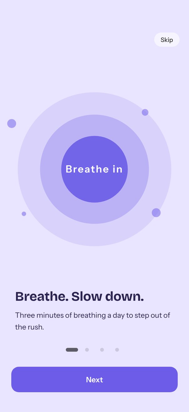
Live demo. Drag it, tap it.
How it works
- Pages are full width with
loop={false}; in each page the art lags byrelativeProgress×0.4of a page while the title and body lead by0.25and0.45and fade. - The
progressshared value blends the background and button colors withinterpolateColorand fades out Skip on the last page. - Next calls
next()and Skip callsscrollTo({ index: 3 });autoplayturns a page every2800ms, and on the last page the demo waits one interval and callsscrollTo({ index: 0 }).
Uses
Full source
import * as React from "react";
import { Pressable, StyleSheet, Text, View } from "react-native";
import { Gesture, GestureDetector } from "react-native-gesture-handler";
import Animated, {
	Easing,
	Extrapolation,
	interpolate,
	interpolateColor,
	type SharedValue,
	useAnimatedStyle,
	useSharedValue,
	withDelay,
	withRepeat,
	withTiming,
} from "react-native-reanimated";
import {
	Carousel,
	type CarouselRef,
	type CarouselRenderItem,
	Pagination,
} from "react-native-reanimated-carousel";
import Svg, { Circle, Path, Rect } from "react-native-svg";

import { SceneScreen, useScene } from "@/features/scenes/kit";

interface IntroPage {
	title: string;
	body: string;
	bg: string;
	ink: string;
	accent: string;
	Art: (props: ArtProps) => React.ReactNode;
}

interface ArtProps {
	page: IntroPage;
	progress: SharedValue<number>; // the page's relativeProgress
}

const PAGES: IntroPage[] = [
	{
		title: "Breathe. Slow down.",
		body: "Three minutes of breathing a day to step out of the rush.",
		bg: "#E9E4FF",
		ink: "#2B2350",
		accent: "#6C5CE7",
		Art: BreathArt,
	},
	{
		title: "One thing at a time",
		body: "Focus timers and white noise to bring your attention back.",
		bg: "#FFE7D4",
		ink: "#4A2A12",
		accent: "#EE7B30",
		Art: FocusArt,
	},
	{
		title: "Sleep well",
		body: "Bedtime stories and fading rain to help you drift off.",
		bg: "#D9F1EA",
		ink: "#12372F",
		accent: "#24997D",
		Art: SleepArt,
	},
	{
		title: "Ready when you are",
		body: "Pick something to practice today. We'll start there.",
		bg: "#E1ECFF",
		ink: "#152A4F",
		accent: "#3B76F6",
		Art: StartArt,
	},
];

const LAST = PAGES.length - 1;
const STEPS = PAGES.map((_, i) => i);
const BACKGROUNDS = PAGES.map((p) => p.bg);
const ACCENTS = PAGES.map((p) => p.accent);
const INTERVAL = 2800;
// Illustrations are laid out on a 430 x 320 stage, then scaled to the screen.
const ART_W = 430;
const ART_H = 320;
const COPY_HEIGHT = 94 + 32; // title, body and the gap above the dots

export default function Scene() {
	return (
		<SceneScreen
			background={PAGES[0].bg}
			statusBar="dark"
			fonts={[
				"Bricolage-Bold",
				"Instrument-Regular",
				"Instrument-Medium",
				"Instrument-SemiBold",
			]}
		>
			<Onboarding />
		</SceneScreen>
	);
}

function Onboarding() {
	const { width, height, insets } = useScene();
	const ref = React.useRef<CarouselRef>(null);
	const progress = useSharedValue(0);
	const [index, setIndex] = React.useState(0);
	const last = index === LAST;

	// The pages get what the top bar (44 pt) and the footer (dots, 32 pt gap, 54 pt button) leave.
	const bottom = Math.max(insets.bottom + 8, 24);
	const pageHeight = height - insets.top - 44 - (8 + 32 + 54) - bottom;
	const artScale = Math.min(width / 340, (pageHeight - COPY_HEIGHT) / 330);

	// A non-loop autoplay stops on the last page; this demo waits one interval and starts over.
	React.useEffect(() => {
		if (!last) return;
		const timer = setTimeout(
			() => ref.current?.scrollTo({ index: 0 }),
			INTERVAL,
		);
		return () => clearTimeout(timer);
	}, [last]);

	const background = useAnimatedStyle(() => ({
		backgroundColor: interpolateColor(progress.value, STEPS, BACKGROUNDS),
	}));
	const button = useAnimatedStyle(() => ({
		backgroundColor: interpolateColor(progress.value, STEPS, ACCENTS),
	}));
	const skip = useAnimatedStyle(() => ({
		opacity: interpolate(
			progress.value,
			[LAST - 1, LAST],
			[1, 0],
			Extrapolation.CLAMP,
		),
	}));
	const label = useSwapIn(last ? 1 : 0);

	const renderItem = React.useCallback<CarouselRenderItem<IntroPage>>(
		({ item, relativeProgress }) => (
			<Page
				page={item}
				width={width}
				artScale={artScale}
				progress={relativeProgress}
			/>
		),
		[width, artScale],
	);

	return (
		<View
			style={[styles.screen, { paddingTop: insets.top, paddingBottom: bottom }]}
		>
			<Animated.View style={[StyleSheet.absoluteFill, background]} />
			<View style={styles.topBar}>
				<Animated.View
					style={[skip, { pointerEvents: last ? "none" : "auto" }]}
				>
					<Pressable
						style={styles.skip}
						hitSlop={8}
						onPress={() => ref.current?.scrollTo({ index: LAST })}
					>
						<Text style={styles.skipLabel}>Skip</Text>
					</Pressable>
				</Animated.View>
			</View>

			<Carousel
				ref={ref}
				loop={false}
				autoplay={!last}
				autoplayInterval={INTERVAL}
				data={PAGES}
				style={{ width, height: pageHeight }}
				animation={{
					type: "timing",
					duration: 600,
					easing: Easing.out(Easing.poly(4)),
				}}
				progress={progress}
				onSnapToItem={setIndex}
				renderItem={renderItem}
			/>

			<Pagination
				count={PAGES.length}
				progress={progress}
				onPress={(i) => ref.current?.scrollTo({ index: i })}
				containerStyle={styles.dots}
				dotStyle={{ width: 8, height: 8, backgroundColor: "#0000001F" }}
				activeDotStyle={{ width: 26, backgroundColor: "#00000099" }}
			/>
			<Pressable
				accessibilityRole="button"
				onPress={() =>
					last ? ref.current?.scrollTo({ index: 0 }) : ref.current?.next()
				}
			>
				<Animated.View style={[styles.button, button]}>
					<Animated.Text style={[styles.buttonLabel, label]}>
						{last ? "Get started" : "Next"}
					</Animated.Text>
				</Animated.View>
			</Pressable>
		</View>
	);
}

// The art lags behind the page (× 0.4 of a page) while the title and body lead (× 0.25, × 0.45).
const Page = React.memo(function Page(props: {
	page: IntroPage;
	width: number;
	artScale: number;
	progress: SharedValue<number>;
}) {
	const { page, width, artScale, progress } = props;
	const art = useAnimatedStyle(() => ({
		transform: [
			{ translateX: -progress.value * width * 0.4 },
			{ scale: artScale },
		],
	}));
	const title = useLead(progress, width * 0.25);
	const body = useLead(progress, width * 0.45);
	return (
		<View style={styles.page}>
			<View style={styles.artArea}>
				<Animated.View style={[styles.art, art]}>
					<page.Art page={page} progress={progress} />
				</Animated.View>
			</View>
			<View style={styles.copy}>
				<Animated.Text style={[styles.title, { color: page.ink }, title]}>
					{page.title}
				</Animated.Text>
				<Animated.Text style={[styles.body, { color: page.ink }, body]}>
					{page.body}
				</Animated.Text>
			</View>
		</View>
	);
});

function useLead(progress: SharedValue<number>, distance: number) {
	return useAnimatedStyle(() => ({
		opacity: 1 - Math.min(1, Math.abs(progress.value)),
		transform: [{ translateX: progress.value * distance }],
	}));
}

// Ornaments drift k pt per page of progress, on top of the art's own parallax.
function Float(props: {
	x: number;
	y: number;
	k: number;
	progress: SharedValue<number>;
	rotate?: number;
	scale?: number;
	children: React.ReactNode;
}) {
	const { x, y, k, progress, rotate = 0, scale = 1 } = props;
	const drift = useAnimatedStyle(() => ({
		transform: [
			{ translateX: progress.value * k },
			{ rotate: `${rotate}deg` },
			{ scale },
		],
	}));
	return (
		<Animated.View style={[styles.absolute, { left: x, top: y }, drift]}>
			{props.children}
		</Animated.View>
	);
}

// Eases from `from` to `to` and back forever, starting after `delay` ms.
function useLoop(from: number, to: number, period: number, delay: number) {
	const value = useSharedValue(from);
	React.useEffect(() => {
		const half = withTiming(to, {
			duration: period / 2,
			easing: Easing.inOut(Easing.ease),
		});
		value.value = withDelay(delay, withRepeat(half, -1, true));
	}, [value, to, period, delay]);
	return value;
}

const RINGS = [
	{ size: 262, opacity: 0.12, delay: 500 },
	{ size: 190, opacity: 0.28, delay: 250 },
	{ size: 120, opacity: 0.9, delay: 0 },
];
const MOTES = [
	{ x: 58, y: 70, k: 60, size: 16 },
	{ x: 300, y: 52, k: -50, size: 12 },
	{ x: 318, y: 230, k: 90, size: 16 },
	{ x: 84, y: 236, k: -80, size: 8 },
];

function BreathArt({ page, progress }: ArtProps) {
	return (
		<>
			{RINGS.map((ring) => (
				<Ring key={ring.size} {...ring} color={page.accent} />
			))}
			<Text style={styles.breathe}>Breathe in</Text>
			{MOTES.map(({ size, ...mote }) => (
				<Float key={mote.k} {...mote} progress={progress}>
					<View
						style={[
							styles.mote,
							{
								width: size,
								height: size,
								borderRadius: size / 2,
								backgroundColor: page.accent,
							},
						]}
					/>
				</Float>
			))}
		</>
	);
}

// Each ring pulses between 0.9 and 1.06 every 3.2 s, the outer ones a little later.
function Ring(props: {
	size: number;
	opacity: number;
	delay: number;
	color: string;
}) {
	const { size, opacity, delay, color } = props;
	const scale = useLoop(0.9, 1.06, 3200, delay);
	const pulse = useAnimatedStyle(() => ({
		transform: [{ scale: scale.value }],
	}));
	const box = {
		width: size,
		height: size,
		borderRadius: size / 2,
		left: (ART_W - size) / 2,
	};
	return (
		<Animated.View
			style={[
				styles.absolute,
				box,
				{ top: (ART_H - size) / 2, opacity, backgroundColor: color },
				pulse,
			]}
		/>
	);
}

const LEAVES = [
	{ x: 64, y: 60, k: 70 },
	{ x: 316, y: 96, k: -60, rotate: 30 },
	{ x: 300, y: 240, k: 110 },
];

function FocusArt({ page, progress }: ArtProps) {
	return (
		<>
			<View style={styles.timer}>
				<Svg
					width={220}
					height={220}
					viewBox="0 0 220 220"
					style={StyleSheet.absoluteFill}
				>
					<Circle cx={110} cy={110} r={92} fill="#FFFFFF" opacity={0.7} />
					<Circle
						cx={110}
						cy={110}
						r={80}
						fill="none"
						stroke="#00000014"
						strokeWidth={14}
					/>
					{/* 70% of the ring, clockwise from 12 o'clock */}
					<Path
						d="M110 30A80 80 0 1 1 33.9 134.6"
						fill="none"
						stroke={page.accent}
						strokeWidth={14}
						strokeLinecap="round"
					/>
				</Svg>
				<Text style={[styles.clock, { color: page.ink }]}>18:42</Text>
				<Text style={[styles.clockLabel, { color: page.ink }]}>Focusing</Text>
			</View>
			{LEAVES.map((leaf) => (
				<Float key={leaf.k} {...leaf} progress={progress}>
					<View
						style={[
							styles.leaf,
							{ backgroundColor: page.accent, opacity: 0.55 },
						]}
					/>
				</Float>
			))}
		</>
	);
}

const STARS = [
	{ x: 70, y: 60, k: 40, delay: 0 },
	{ x: 320, y: 70, k: -30, delay: 600 },
	{ x: 290, y: 200, k: 80, delay: 1100 },
	{ x: 96, y: 220, k: -70, delay: 300 },
];

function SleepArt({ page, progress }: ArtProps) {
	return (
		<>
			<Svg width={190} height={190} viewBox="0 0 200 200">
				<Path
					d="M132 30A78 78 0 1 0 172 150A64 64 0 1 1 132 30Z"
					fill={page.accent}
				/>
			</Svg>
			{STARS.map(({ delay, ...star }) => (
				<Float key={star.k} {...star} progress={progress}>
					<Star color={page.accent} delay={delay} />
				</Float>
			))}
			<Float x={60} y={232} k={120} progress={progress}>
				<Cloud />
			</Float>
			<Float x={250} y={110} k={-90} scale={0.7} progress={progress}>
				<Cloud />
			</Float>
		</>
	);
}

// A four-point star that twinkles between 0.9 and 0.25 opacity every 2.4 s.
function Star({ color, delay }: { color: string; delay: number }) {
	const opacity = useLoop(0.9, 0.25, 2400, delay);
	const twinkle = useAnimatedStyle(() => ({ opacity: opacity.value }));
	return (
		<Animated.View style={twinkle}>
			<Svg width={14} height={14} viewBox="0 0 100 100">
				<Path
					d="M50 0L61 39L100 50L61 61L50 100L39 61L0 50L39 39Z"
					fill={color}
				/>
			</Svg>
		</Animated.View>
	);
}

// A 90 x 30 pill with a puff on top; the whole cloud is 85% opaque.
function Cloud() {
	return (
		<Svg width={90} height={48} style={styles.cloud}>
			<Rect y={18} width={90} height={30} rx={15} fill="#FFFFFF" />
			<Circle cx={38} cy={20} r={20} fill="#FFFFFF" />
		</Svg>
	);
}

const PRACTICES = [
	{ label: "Breathe · 3 min", color: "#6C5CE7", k: -60 },
	{ label: "Focus · 25 min", color: "#EE7B30", k: 40 },
	{ label: "Bedtime stories", color: "#24997D", k: 110 },
];

function StartArt({ page, progress }: ArtProps) {
	const [picked, setPicked] = React.useState(1);
	return (
		<View style={styles.chips}>
			{PRACTICES.map((practice, i) => (
				<Chip
					key={practice.label}
					practice={practice}
					on={i === picked}
					page={page}
					progress={progress}
					onPick={() => setPicked(i)}
				/>
			))}
		</View>
	);
}

// A Tap gesture (not Pressable) so that a swipe starting on a chip never selects it.
function Chip(props: {
	practice: (typeof PRACTICES)[number];
	on: boolean;
	page: IntroPage;
	progress: SharedValue<number>;
	onPick: () => void;
}) {
	const { practice, on, page, progress, onPick } = props;
	const drift = useAnimatedStyle(() => ({
		transform: [{ translateX: progress.value * practice.k }],
	}));
	const tap = React.useMemo(
		() =>
			Gesture.Tap()
				.maxDistance(10)
				.runOnJS(true)
				.onEnd((_event, success) => {
					if (success) onPick();
				}),
		[onPick],
	);
	return (
		<GestureDetector gesture={tap}>
			<Animated.View
				accessible
				accessibilityRole="radio"
				aria-checked={on}
				style={[styles.chip, on && { borderColor: page.accent }, drift]}
			>
				<View style={[styles.chipDot, { backgroundColor: practice.color }]} />
				<Text style={[styles.chipLabel, { color: page.ink }]}>
					{practice.label}
				</Text>
				{on && (
					<Svg width={16} height={16} viewBox="0 0 16 16" style={styles.check}>
						<Path
							d="M3 8.5l3.2 3L13 4.5"
							stroke={page.accent}
							strokeWidth={2.2}
							{...ROUND}
						/>
					</Svg>
				)}
			</Animated.View>
		</GestureDetector>
	);
}

// Fades and lifts new text in when `key` changes (not on the first render).
function useSwapIn(key: number) {
	const t = useSharedValue(1);
	const shown = React.useRef(key);
	React.useEffect(() => {
		if (shown.current === key) return;
		shown.current = key;
		t.value = 0;
		t.value = withTiming(1, {
			duration: 350,
			easing: Easing.out(Easing.cubic),
		});
	}, [key, t]);
	return useAnimatedStyle(() => ({
		opacity: t.value,
		transform: [{ translateY: (1 - t.value) * 6 }],
	}));
}

const ROUND = {
	strokeLinecap: "round",
	strokeLinejoin: "round",
	fill: "none",
} as const;
const CENTER = { alignItems: "center", justifyContent: "center" } as const;

function text(
	fontFamily: string,
	fontSize: number,
	lineHeight: number,
	color?: string,
) {
	return { fontFamily, fontSize, lineHeight, color };
}

const styles = StyleSheet.create({
	screen: { flex: 1 },
	topBar: {
		height: 44,
		flexDirection: "row",
		justifyContent: "flex-end",
		paddingHorizontal: 20,
	},
	skip: {
		marginTop: 7,
		padding: 7,
		paddingHorizontal: 14,
		borderRadius: 15,
		backgroundColor: "#FFFFFF99",
	},
	skipLabel: text("Instrument-Medium", 13, 16, "#333333"),
	page: { flex: 1, overflow: "hidden" },
	artArea: { ...CENTER, flex: 1 },
	art: { ...CENTER, width: ART_W, height: ART_H },
	copy: { height: 94, marginBottom: 32, paddingHorizontal: 32 },
	title: { ...text("Bricolage-Bold", 28, 34), letterSpacing: -0.28 },
	body: {
		...text("Instrument-Regular", 15.5, 25),
		marginTop: 10,
		paddingRight: 8,
	},
	dots: { alignSelf: "center", gap: 6, marginBottom: 32 },
	button: { ...CENTER, height: 54, marginHorizontal: 24, borderRadius: 16 },
	buttonLabel: text("Instrument-SemiBold", 16, 20, "#FFFFFF"),
	absolute: { position: "absolute" },
	breathe: {
		...text("Instrument-SemiBold", 18, 22, "#FFFFFF"),
		letterSpacing: 1.8,
	},
	mote: { opacity: 0.5 },
	timer: { ...CENTER, width: 220, height: 220 },
	clock: text("Bricolage-Bold", 40, 46),
	clockLabel: {
		...text("Instrument-Regular", 13, 16),
		opacity: 0.6,
		marginTop: 2,
	},
	leaf: {
		width: 26,
		height: 26,
		borderTopRightRadius: 15.6,
		borderBottomLeftRadius: 15.6,
	},
	cloud: { opacity: 0.85 },
	chips: { gap: 14 },
	chip: {
		width: 250,
		flexDirection: "row",
		alignItems: "center",
		gap: 12,
		paddingHorizontal: 16,
		paddingVertical: 12,
		borderRadius: 18,
		borderWidth: 2,
		borderColor: "transparent",
		backgroundColor: "#FFFFFF",
		boxShadow: "0px 10px 24px -14px #14285059",
	},
	chipDot: { width: 14, height: 14, borderRadius: 7 },
	chipLabel: text("Instrument-SemiBold", 16, 20),
	check: { marginLeft: "auto" },
});