Product Gallery
Watch product page where a full-width hero carousel and a thumbnail strip follow each other frame by frame.
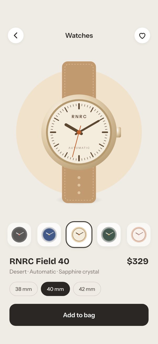
Live demo. Drag it, tap it.
How it works
- The hero pages at full width with
autoplayevery3000ms; each watch turns24°and shrinks to0.7with itsrelativeProgress, andprogressblends the halo color. - The thumbnails are a second
loopcarousel withitemSize76 and a centeringitemAnimation; tapping one callsscrollTo({ index }). - Both carousels get a
scrollOffsetValue; anonBeginobserver fromonConfigurePanGesturemarks which one leads, and a reaction copies its offset to the other, scaled by page size.
Uses
Full source
import * as React from "react";
import { Pressable, StyleSheet, Text, View } from "react-native";
import { Gesture, GestureDetector } from "react-native-gesture-handler";
import Animated, {
	Easing,
	Extrapolation,
	interpolate,
	interpolateColor,
	type SharedValue,
	useAnimatedReaction,
	useAnimatedStyle,
	useSharedValue,
	withTiming,
} from "react-native-reanimated";
import {
	Carousel,
	type CarouselItemAnimation,
	type CarouselPanGesture,
	type CarouselRef,
	type CarouselRenderItem,
} from "react-native-reanimated-carousel";
import Svg, {
	Circle,
	Defs,
	Ellipse,
	Line,
	Path,
	RadialGradient,
	Rect,
	Stop,
} from "react-native-svg";

import { SceneScreen, useScene } from "@/features/scenes/kit";

// Colors in order: strap, stitch, case metal, metal shade, dial, ticks, accent, halo tint.
const WATCHES: Watch[] = [
	watch(
		"Midnight",
		"$329",
		"#22304F #3B4E78 #C9CED6 #8E96A3 #1F3B73 #E8EDF6 #F5C451 #D9E2F2",
	),
	watch(
		"Desert",
		"$329",
		"#C29A6F #E0C49F #E6D3B3 #B59A70 #F4ECDD #5B4630 #C0612B #F1E2CC",
	),
	watch(
		"Forest",
		"$329",
		"#2F4A3A #4F6E5A #A2AAA6 #6E7772 #203A2E #E6E1CF #E9B949 #D8E6DC",
	),
	watch(
		"Rose Gold",
		"$349",
		"#E7C3BC #F3DCD7 #E5B9A2 #B98468 #FFF5F0 #7A4A3A #B76E79 #F7DFD9",
	),
	watch(
		"Jet Black",
		"$379",
		"#151515 #333333 #2E2E30 #151516 #0B0B0C #D8D8D8 #FF5A36 #D9D6D2",
	),
];

function watch(name: string, price: string, colors: string) {
	const [strap, stitch, metal, metalShade, dial, ticks, accent, tint] =
		colors.split(" ");
	return {
		name,
		price,
		strap,
		stitch,
		metal,
		metalShade,
		dial,
		ticks,
		accent,
		tint,
	};
}

type Watch = ReturnType<typeof watch>;

const N = WATCHES.length;
const TINTS = WATCHES.map((w) => w.tint);
const SIZES = ["38 mm", "40 mm", "42 mm"];
const INK = "#2B2724";
const START = 1; // open on Desert

// Minute, hour and quarter ticks of the dial as three paths, on a 200 x 300 grid.
const TICKS = [0, 1, 2].map((kind) => {
	let d = "";
	for (let k = 0; k < 60; k++) {
		const tick = k % 15 === 0 ? 2 : k % 5 === 0 ? 1 : 0;
		if (tick !== kind) continue;
		const a = (k / 60) * Math.PI * 2;
		const r0 = tick ? 50 : 56;
		d += `M${100 + r0 * Math.sin(a)} ${150 - r0 * Math.cos(a)}`;
		d += `L${100 + 60 * Math.sin(a)} ${150 - 60 * Math.cos(a)}`;
	}
	return d;
});
const TICK_WIDTHS = [0.8, 2, 3.2];
const ROUND = {
	strokeWidth: 2,
	strokeLinecap: "round",
	strokeLinejoin: "round",
} as const;

export default function Scene() {
	return (
		<SceneScreen
			background="#EFEBE5"
			statusBar="dark"
			fonts={[
				"Bricolage-Bold",
				"Instrument-Regular",
				"Instrument-Medium",
				"Instrument-SemiBold",
			]}
		>
			<ProductGallery />
		</SceneScreen>
	);
}

function ProductGallery() {
	const { width, height, insets } = useScene();
	// The hero follows the width, but only takes what the header, strip and buy box leave.
	const k = Math.min(
		width / 402,
		(height - insets.top - insets.bottom - 342) / 436,
	);
	const watchWidth = 240 * k;
	const heroHeight = watchWidth * 1.5 + 40 * k;
	const step = 76 * (width / 402); // thumbnail spacing

	const thumbRef = React.useRef<CarouselRef>(null);
	const progress = useSharedValue(START);
	const heroOffset = useSharedValue(-START * width);
	const thumbOffset = useSharedValue(-START * step);
	// Whichever strip the user touched last drives the other one, frame by frame.
	const lead = useSharedValue<"hero" | "thumbs">("hero");
	const [index, setIndex] = React.useState(START);
	const [autoplay, setAutoplay] = React.useState(true);
	const [size, setSize] = React.useState(1);
	const [saved, setSaved] = React.useState(false);
	const [added, setAdded] = React.useState("");
	const watch = WATCHES[index];
	const pick = `${watch.name} ${SIZES[size]}`;

	useAnimatedReaction(
		() => heroOffset.value,
		(offset) => {
			if (lead.value === "hero") thumbOffset.value = (offset / width) * step;
		},
	);
	useAnimatedReaction(
		() => thumbOffset.value,
		(offset) => {
			if (lead.value === "thumbs") heroOffset.value = (offset / step) * width;
		},
	);

	// A touch on either carousel makes it the leader before it starts to move.
	const [heroGesture, thumbGesture] = React.useMemo(
		() =>
			(["hero", "thumbs"] as const).map((who) => (g: CarouselPanGesture) => {
				g.onBegin(() => {
					"worklet";
					lead.value = who;
				});
			}),
		[lead],
	);

	const thumbAnimation = React.useCallback<CarouselItemAnimation>(
		(value) => {
			"worklet";
			return {
				transform: [{ translateX: value * step + (width - step) / 2 }],
				// fade out before an item wraps from one end of the strip to the other
				opacity: interpolate(
					Math.abs(value),
					[0, 2, 2.5],
					[1, 0.65, 0],
					Extrapolation.CLAMP,
				),
			};
		},
		[step, width],
	);

	const renderHero = React.useCallback<CarouselRenderItem<Watch>>(
		({ item, relativeProgress }) => (
			<WatchSlide watch={item} width={watchWidth} progress={relativeProgress} />
		),
		[watchWidth],
	);

	const selectThumb = React.useCallback(
		(i: number) => {
			lead.value = "thumbs";
			thumbRef.current?.scrollTo({ index: i });
		},
		[lead],
	);
	const renderThumb = React.useCallback<CarouselRenderItem<Watch>>(
		({ item, index: i, relativeProgress }) => (
			<Thumb
				watch={item}
				index={i}
				size={60 * (width / 402)}
				progress={relativeProgress}
				onSelect={selectThumb}
			/>
		),
		[width, selectThumb],
	);

	const halo = useAnimatedStyle(() => {
		const i = Math.floor(progress.value);
		const a = ((i % N) + N) % N;
		return {
			backgroundColor: interpolateColor(
				progress.value - i,
				[0, 1],
				[TINTS[a], TINTS[(a + 1) % N]],
			),
		};
	});
	const swap = useSwapIn(index);
	const haloSize = 320 * k;
	const haloBox = {
		left: (width - haloSize) / 2,
		marginTop: -haloSize / 2,
		width: haloSize,
		height: haloSize,
		borderRadius: haloSize / 2,
	};

	return (
		<View
			style={[
				styles.screen,
				{ paddingTop: insets.top, paddingBottom: insets.bottom + 12 },
			]}
		>
			<View style={styles.topBar}>
				<View
					style={styles.iconButton}
					accessibilityRole="button"
					accessibilityLabel="Back"
				>
					<Svg width={22} height={22} viewBox="0 0 24 24">
						<Path
							d="M15 5l-7 7 7 7"
							stroke={INK}
							fill="none"
							{...ROUND}
							strokeWidth={2.4}
						/>
					</Svg>
				</View>
				<Text style={styles.title}>Watches</Text>
				<Pressable
					style={styles.iconButton}
					accessibilityRole="button"
					accessibilityLabel={
						saved ? "Remove from favorites" : "Add to favorites"
					}
					onPress={() => setSaved((v) => !v)}
				>
					<Svg width={22} height={22} viewBox="0 0 24 24">
						<Path
							d="M12 20.5s-7.5-4.6-7.5-10.2A4.3 4.3 0 0 1 12 7.6a4.3 4.3 0 0 1 7.5 2.7c0 5.6-7.5 10.2-7.5 10.2z"
							stroke={saved ? "#D6455D" : INK}
							fill={saved ? "#D6455D" : "none"}
							{...ROUND}
						/>
					</Svg>
				</Pressable>
			</View>

			<View style={styles.hero}>
				<Animated.View style={[styles.halo, haloBox, halo]} />
				<Carousel
					loop
					autoplay={autoplay}
					autoplayInterval={3000}
					defaultIndex={START}
					data={WATCHES}
					style={{ width, height: heroHeight }}
					scrollOffsetValue={heroOffset}
					progress={progress}
					onConfigurePanGesture={heroGesture}
					onScrollStart={() => {
						lead.value = "hero";
					}}
					onSnapToItem={setIndex}
					renderItem={renderHero}
				/>
			</View>

			<Carousel
				ref={thumbRef}
				loop
				defaultIndex={START}
				data={WATCHES}
				style={{ width, height: 84 * (width / 402) }}
				itemSize={step}
				itemAnimation={thumbAnimation}
				scrollOffsetValue={thumbOffset}
				onConfigurePanGesture={thumbGesture}
				onScrollStart={() => setAutoplay(false)}
				onSnapToItem={(i) => {
					setIndex(i);
					setAutoplay(true);
				}}
				renderItem={renderThumb}
			/>

			<View style={styles.info}>
				<View style={styles.row}>
					<Text style={styles.name}>RNRC Field 40</Text>
					<Animated.Text style={[styles.name, swap]}>
						{watch.price}
					</Animated.Text>
				</View>
				<Animated.Text style={[styles.variant, swap]}>
					{watch.name} · Automatic · Sapphire crystal
				</Animated.Text>
				<View style={styles.sizes}>
					{SIZES.map((label, i) => (
						<Pressable
							key={label}
							accessibilityRole="radio"
							accessibilityState={{ selected: i === size }}
							onPress={() => setSize(i)}
							style={[styles.size, i === size && styles.sizeOn]}
						>
							<Text
								style={[styles.sizeLabel, i === size && styles.sizeLabelOn]}
							>
								{label}
							</Text>
						</Pressable>
					))}
				</View>
			</View>

			<Pressable
				style={styles.buy}
				accessibilityRole="button"
				onPress={() => setAdded(pick)}
			>
				<Text style={styles.buyLabel}>
					{added === pick ? "Added to bag" : "Add to bag"}
				</Text>
			</Pressable>
		</View>
	);
}

// Fades new text in with a short rise whenever `key` changes (not on mount).
function useSwapIn(key: number) {
	const t = useSharedValue(1);
	const shown = React.useRef(key);
	React.useEffect(() => {
		if (shown.current === key) return;
		shown.current = key;
		t.value = 0;
		t.value = withTiming(1, {
			duration: 350,
			easing: Easing.out(Easing.cubic),
		});
	}, [key, t]);
	return useAnimatedStyle(() => ({
		opacity: t.value,
		transform: [{ translateY: (1 - t.value) * 6 }],
	}));
}

// Hero page: the watch turns 24° and shrinks to 0.7 as it leaves the center.
const WatchSlide = React.memo(function WatchSlide(props: {
	watch: Watch;
	width: number;
	progress: SharedValue<number>;
}) {
	const { watch, width, progress } = props;
	const turn = useAnimatedStyle(() => {
		const d = Math.min(1, Math.abs(progress.value));
		return {
			transform: [
				{ rotateZ: `${progress.value * -24}deg` },
				{ scale: 1 - 0.3 * d },
			],
		};
	});
	return (
		<View style={styles.slide}>
			<Svg
				style={[styles.shadow, { width: width * 0.75, height: width * 0.1 }]}
				viewBox="0 0 100 20"
			>
				<Defs>
					<RadialGradient id="watch-shadow" cx="50%" cy="50%" r="50%">
						<Stop offset="0" stopColor="#000000" stopOpacity={0.2} />
						<Stop offset="1" stopColor="#000000" stopOpacity={0} />
					</RadialGradient>
				</Defs>
				<Ellipse cx={50} cy={10} rx={50} ry={10} fill="url(#watch-shadow)" />
			</Svg>
			<Animated.View style={[{ width, height: width * 1.5 }, turn]}>
				<WatchArt watch={watch} width={width} />
			</Animated.View>
		</View>
	);
});

function WatchArt({ watch, width }: { watch: Watch; width: number }) {
	const f = width / 200; // drawn on a 200 x 300 grid
	const metal = `metal-${watch.name}`;
	// a hand from `tail` behind the center to `length` in front, at `deg` from 12 o'clock
	const hand = (
		deg: number,
		length: number,
		tail: number,
		strokeWidth: number,
		stroke: string,
	) => {
		const a = (deg * Math.PI) / 180;
		const [sin, cos] = [Math.sin(a), Math.cos(a)];
		const [x1, y1, x2, y2] = [
			100 - tail * sin,
			150 + tail * cos,
			100 + length * sin,
			150 - length * cos,
		];
		return {
			x1,
			y1,
			x2,
			y2,
			stroke,
			strokeWidth,
			strokeLinecap: "round",
		} as const;
	};
	const label = (top: number, size: number, spacing: number) => ({
		top: top * f,
		fontSize: size * f,
		lineHeight: size * 1.3 * f,
		letterSpacing: spacing * f,
		paddingLeft: spacing * f, // keeps letter-spaced text centered
		color: watch.ticks,
	});
	const stitch = { fill: "none", stroke: watch.stitch, strokeDasharray: "3 3" };
	return (
		<>
			<Svg width={width} height={width * 1.5} viewBox="0 0 200 300">
				<Defs>
					<RadialGradient id={metal} cx="35%" cy="30%" r="80%">
						<Stop offset="0" stopColor="#FFFFFF" stopOpacity={0.75} />
						<Stop offset="0.45" stopColor={watch.metal} />
						<Stop offset="1" stopColor={watch.metalShade} />
					</RadialGradient>
				</Defs>
				{[0, 188].map((y) => (
					<React.Fragment key={y}>
						<Rect
							x={64}
							y={y}
							width={72}
							height={112}
							rx={12}
							fill={watch.strap}
						/>
						<Rect x={70} y={y + 6} width={60} height={100} rx={8} {...stitch} />
					</React.Fragment>
				))}
				{[246, 262, 278].map((cy) => (
					<Circle key={cy} cx={100} cy={cy} r={3} fill={watch.stitch} />
				))}
				<Rect
					x={176}
					y={139}
					width={13}
					height={22}
					rx={3}
					fill={`url(#${metal})`}
				/>
				<Circle cx={100} cy={150} r={80} fill={`url(#${metal})`} />
				<Circle cx={100} cy={150} r={70} fill={watch.metalShade} />
				<Circle cx={100} cy={150} r={66} fill={watch.dial} />
				{TICKS.map((d, i) => (
					<Path
						key={d}
						d={d}
						stroke={watch.ticks}
						{...ROUND}
						strokeWidth={TICK_WIDTHS[i]}
					/>
				))}
			</Svg>
			<Text style={[styles.dialText, styles.dialBrand, label(112, 9, 2)]}>
				RNRC
			</Text>
			<Text style={[styles.dialText, styles.dialSub, label(180, 5.5, 1.5)]}>
				AUTOMATIC
			</Text>
			{/* the hands sit above the dial text */}
			<Svg style={StyleSheet.absoluteFill} viewBox="0 0 200 300">
				<Line {...hand(-60, 32, 6, 6, watch.ticks)} />
				<Line {...hand(60, 48, 8, 4, watch.ticks)} />
				<Line {...hand(195, 54, 14, 1.4, watch.accent)} />
				<Circle cx={100} cy={150} r={4.5} fill={watch.accent} />
			</Svg>
		</>
	);
}

// Thumbnail with a ring that fades in as it reaches the center.
// Thumbnail with a ring that fades in as it reaches the center. A Tap gesture (not
// Pressable) so that a drag starting on a thumbnail never ends as a press.
const Thumb = React.memo(function Thumb(props: {
	watch: Watch;
	index: number;
	size: number;
	progress: SharedValue<number>;
	onSelect: (index: number) => void;
}) {
	const { watch, index, size, progress, onSelect } = props;
	const ring = useAnimatedStyle(() => ({
		opacity: 1 - Math.min(1, Math.abs(progress.value)),
	}));
	const tap = React.useMemo(
		() =>
			Gesture.Tap()
				.maxDistance(10)
				.runOnJS(true)
				.onEnd((_event, success) => {
					if (success) onSelect(index);
				}),
		[index, onSelect],
	);
	return (
		<View style={styles.slide}>
			<GestureDetector gesture={tap}>
				<View
					accessible
					accessibilityRole="button"
					accessibilityLabel={watch.name}
					style={[
						styles.thumb,
						{ width: size, height: size, borderRadius: size * 0.3 },
					]}
				>
					<Svg width={size * 0.74} height={size * 0.74} viewBox="0 0 60 60">
						<Circle cx={30} cy={30} r={27} fill={watch.metal} />
						<Circle cx={30} cy={30} r={23} fill={watch.metalShade} />
						<Circle cx={30} cy={30} r={21} fill={watch.dial} />
						<Line
							x1={30}
							y1={30}
							x2={20}
							y2={24}
							stroke={watch.ticks}
							{...ROUND}
							strokeWidth={2.6}
						/>
						<Line
							x1={30}
							y1={30}
							x2={44}
							y2={22}
							stroke={watch.ticks}
							{...ROUND}
							strokeWidth={1.8}
						/>
						<Circle cx={30} cy={30} r={2} fill={watch.accent} />
					</Svg>
					<Animated.View
						style={[styles.ring, { borderRadius: size * 0.3 + 4 }, ring]}
					/>
				</View>
			</GestureDetector>
		</View>
	);
});

const styles = StyleSheet.create({
	screen: { flex: 1, backgroundColor: "#EFEBE5" },
	topBar: {
		height: 56,
		paddingHorizontal: 20,
		flexDirection: "row",
		alignItems: "center",
		justifyContent: "space-between",
	},
	iconButton: {
		width: 40,
		height: 40,
		borderRadius: 20,
		backgroundColor: "#FFFFFF",
		alignItems: "center",
		justifyContent: "center",
		boxShadow: "0px 2px 8px #0000000F",
	},
	title: {
		fontFamily: "Instrument-SemiBold",
		fontSize: 17,
		lineHeight: 22,
		color: INK,
	},
	hero: { flex: 1, justifyContent: "center", alignItems: "center" },
	halo: { position: "absolute", top: "50%" },
	slide: { flex: 1, alignItems: "center", justifyContent: "center" },
	shadow: { position: "absolute", bottom: "4%" },
	dialText: { position: "absolute", left: 0, right: 0, textAlign: "center" },
	dialBrand: { fontFamily: "Instrument-SemiBold" },
	dialSub: { fontFamily: "Instrument-Regular", opacity: 0.7 },
	thumb: {
		backgroundColor: "#FFFFFF",
		alignItems: "center",
		justifyContent: "center",
		boxShadow: "0px 4px 12px #0000000F",
	},
	ring: {
		position: "absolute",
		top: -4,
		right: -4,
		bottom: -4,
		left: -4,
		borderWidth: 2,
		borderColor: INK,
	},
	info: { paddingHorizontal: 24, marginTop: 12 },
	row: {
		flexDirection: "row",
		justifyContent: "space-between",
		alignItems: "baseline",
	},
	name: {
		fontFamily: "Bricolage-Bold",
		fontSize: 22,
		lineHeight: 28,
		color: INK,
	},
	variant: {
		fontFamily: "Instrument-Regular",
		fontSize: 14,
		lineHeight: 20,
		color: "#7A716A",
		marginTop: 2,
	},
	sizes: { flexDirection: "row", gap: 8, marginTop: 16 },
	size: {
		height: 36,
		paddingHorizontal: 14,
		borderRadius: 18,
		borderWidth: 1,
		borderColor: "#D6CFC6",
		justifyContent: "center",
	},
	sizeOn: { backgroundColor: INK, borderColor: INK },
	sizeLabel: {
		fontFamily: "Instrument-Medium",
		fontSize: 13,
		lineHeight: 16,
		color: "#5C554F",
	},
	sizeLabelOn: { color: "#FFFFFF" },
	buy: {
		marginTop: 20,
		marginHorizontal: 24,
		height: 56,
		borderRadius: 16,
		backgroundColor: INK,
		alignItems: "center",
		justifyContent: "center",
	},
	buyLabel: {
		fontFamily: "Instrument-SemiBold",
		fontSize: 16,
		lineHeight: 20,
		color: "#FFFFFF",
	},
});